We will probably soon make our way out of an unusually long La Niña episode (2 years so far). During a La Niña spell, the ocean surface is colder than normal in a large part of the eastern tropical Pacific, starting off the coast of South America and stretching far out to the open ocean. It is likely that an El Niño episode will start within a few years.
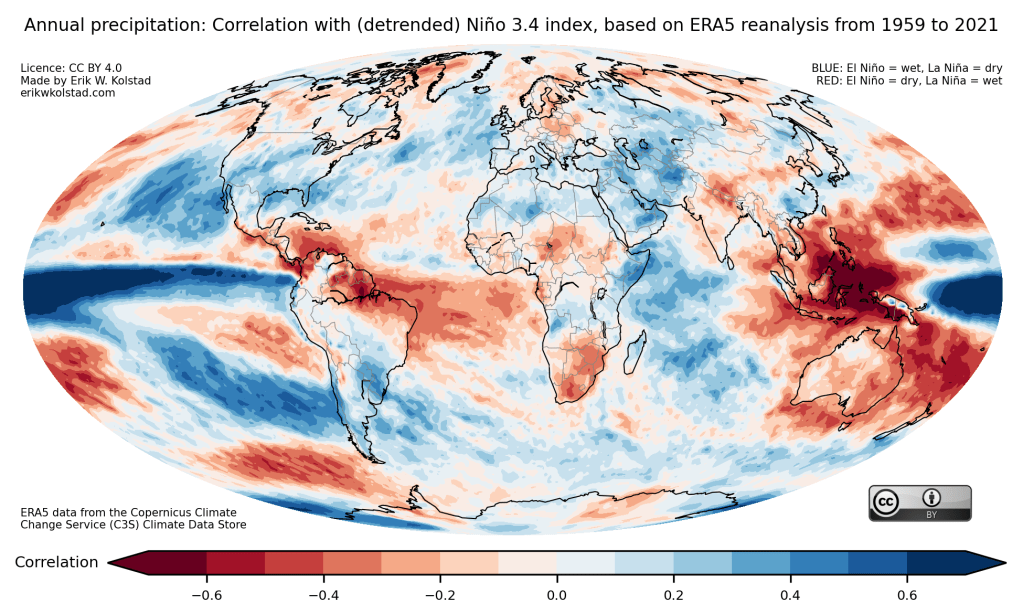
Both La Niña and El Niño influence weather more or less everywhere. The map below illustrates the linkage between precipitation (rain and snow) and El Niño/La Niña. The blue colours show areas that are usually wetter-than-normal during El Niño and drier-than-normal during La Niña. For instance, the current drought in East Africa, where the food security of millions is at risk, is linked to the ongoing La Niña. In the map, red colours indicate where El Niño episodes are dry and La Niña periods wet. Feel free to share and reuse.

Read more about the El Niño & La Niña (El Niño-Southern Oscillation) phenomenon here.
Here’s the same map but with a detrended Niño 3.4 index:

The difference is marginal.
