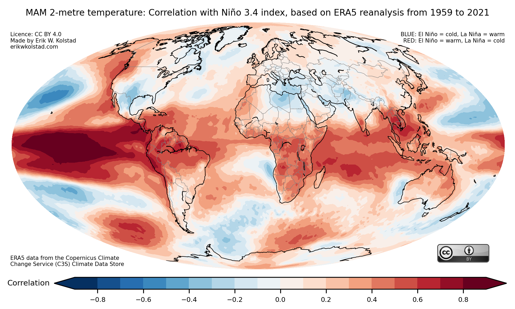
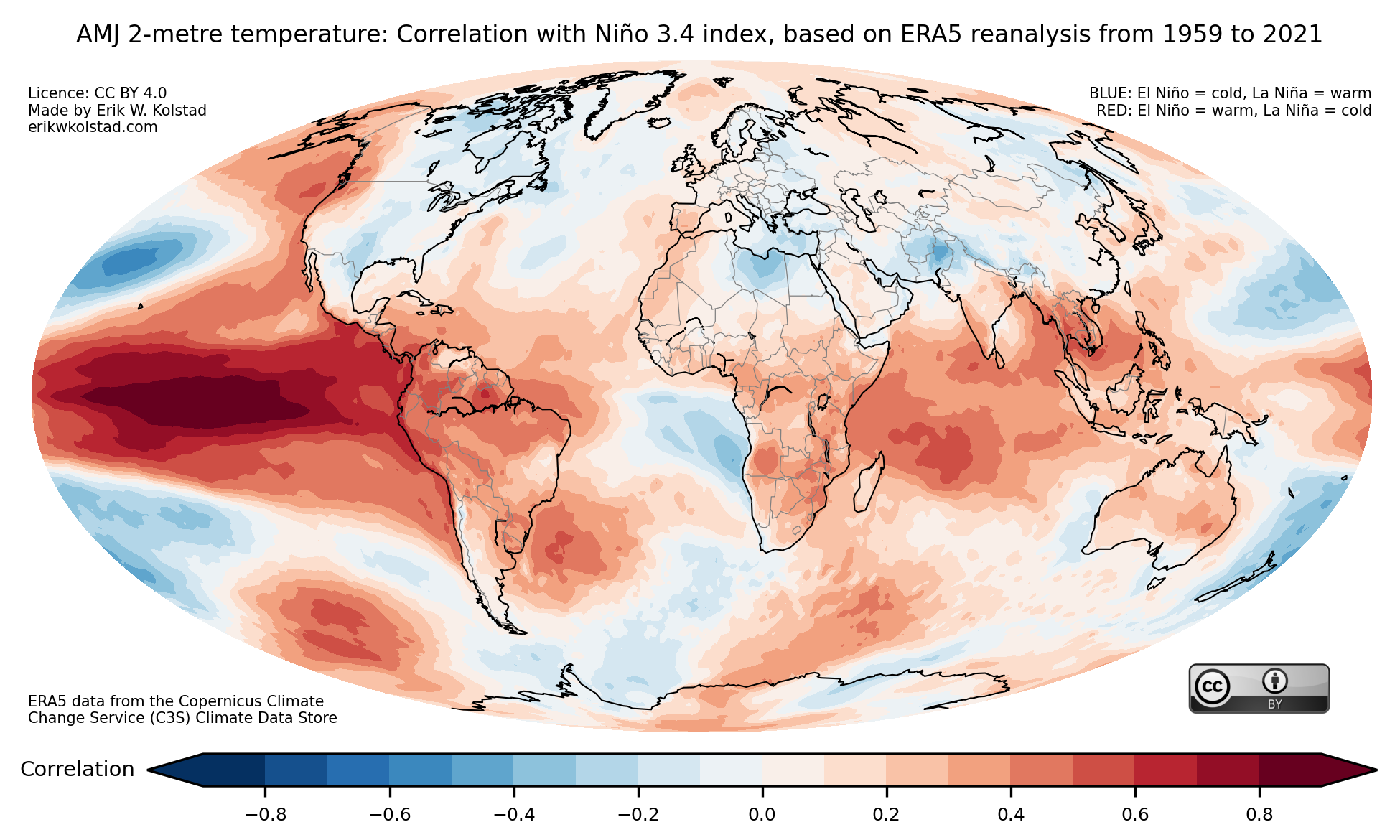
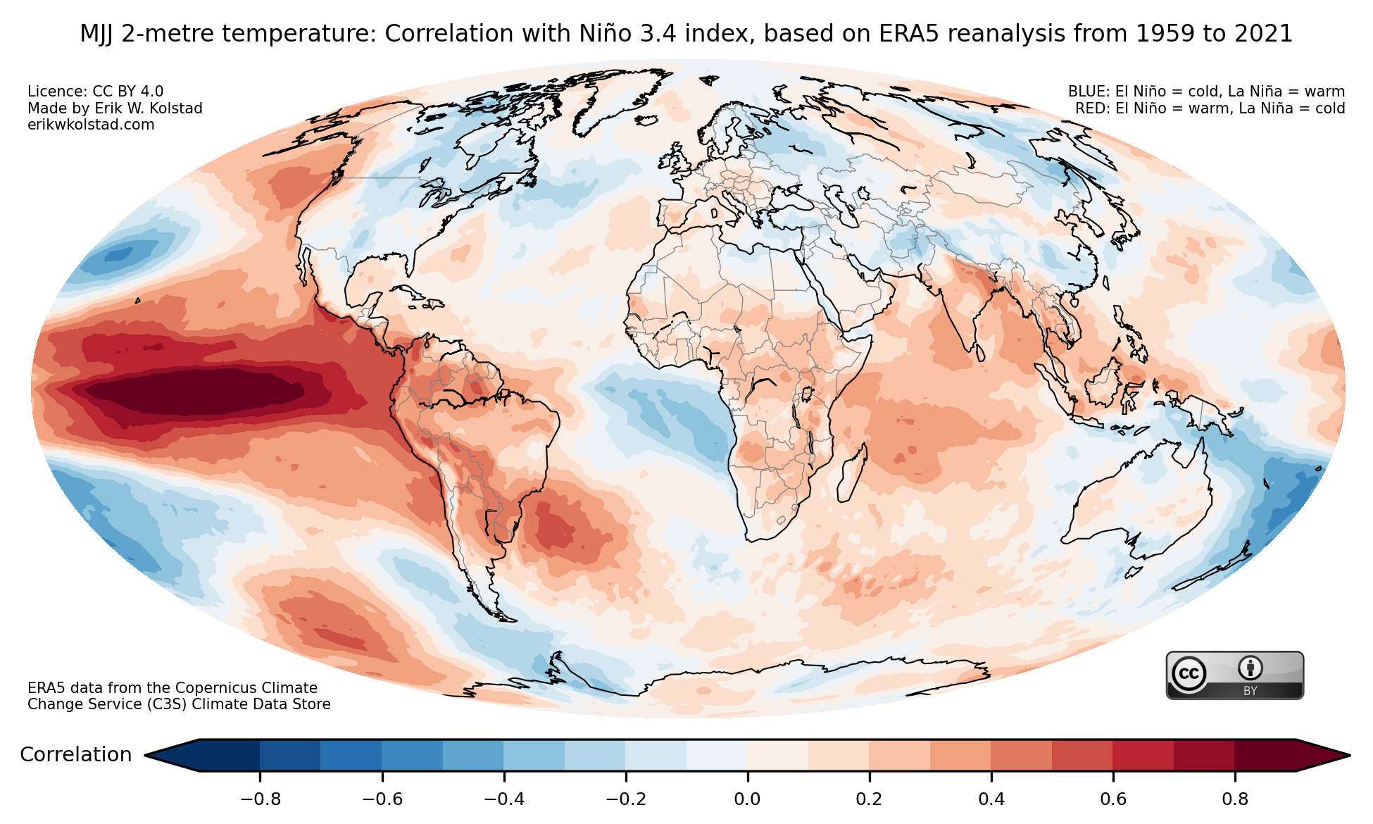
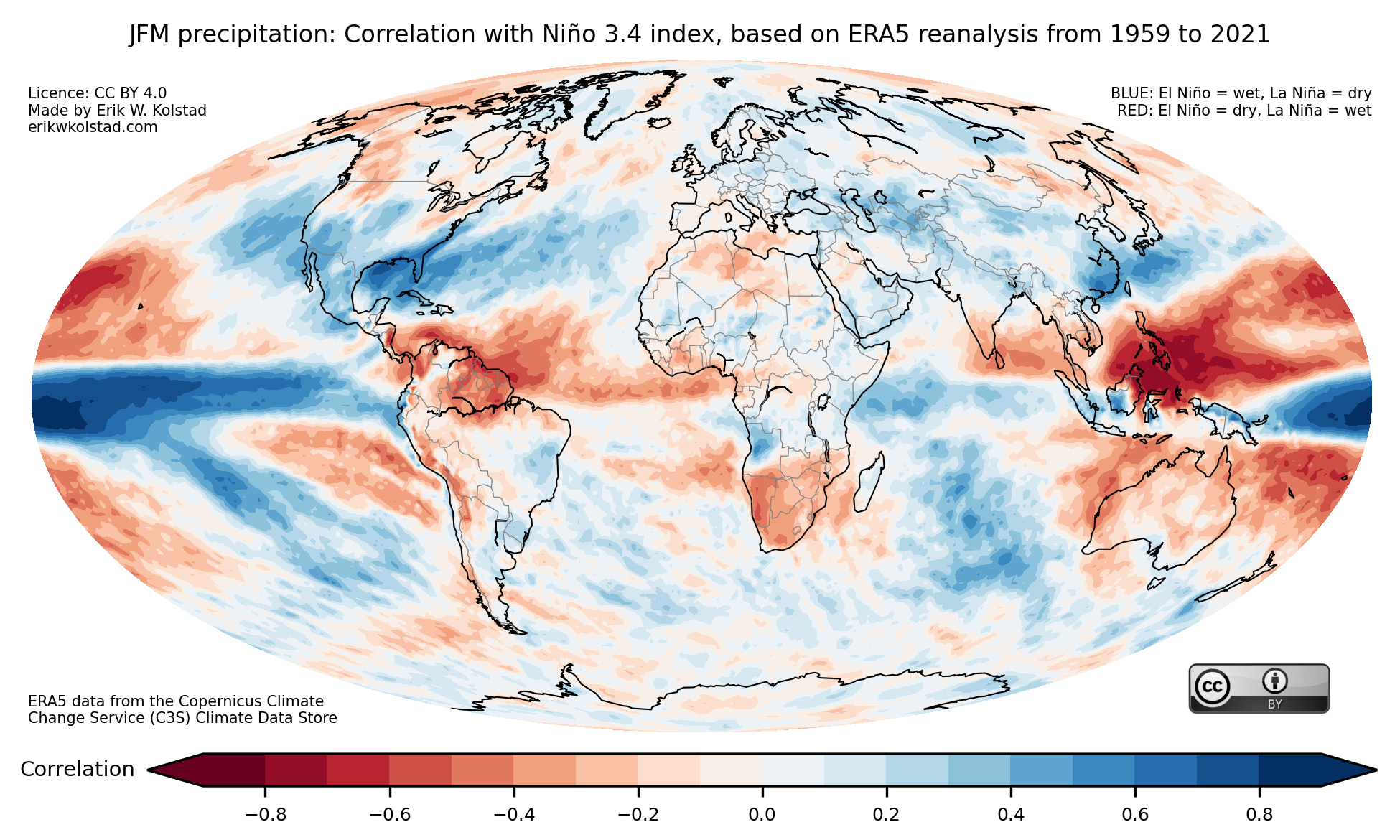
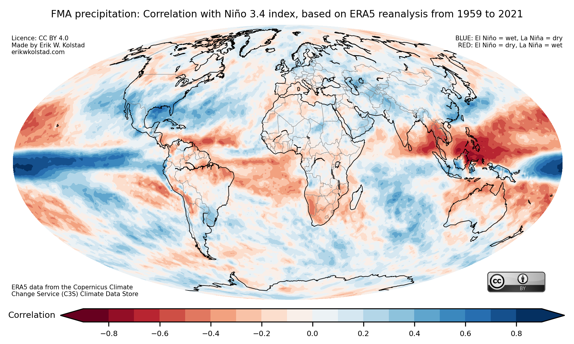
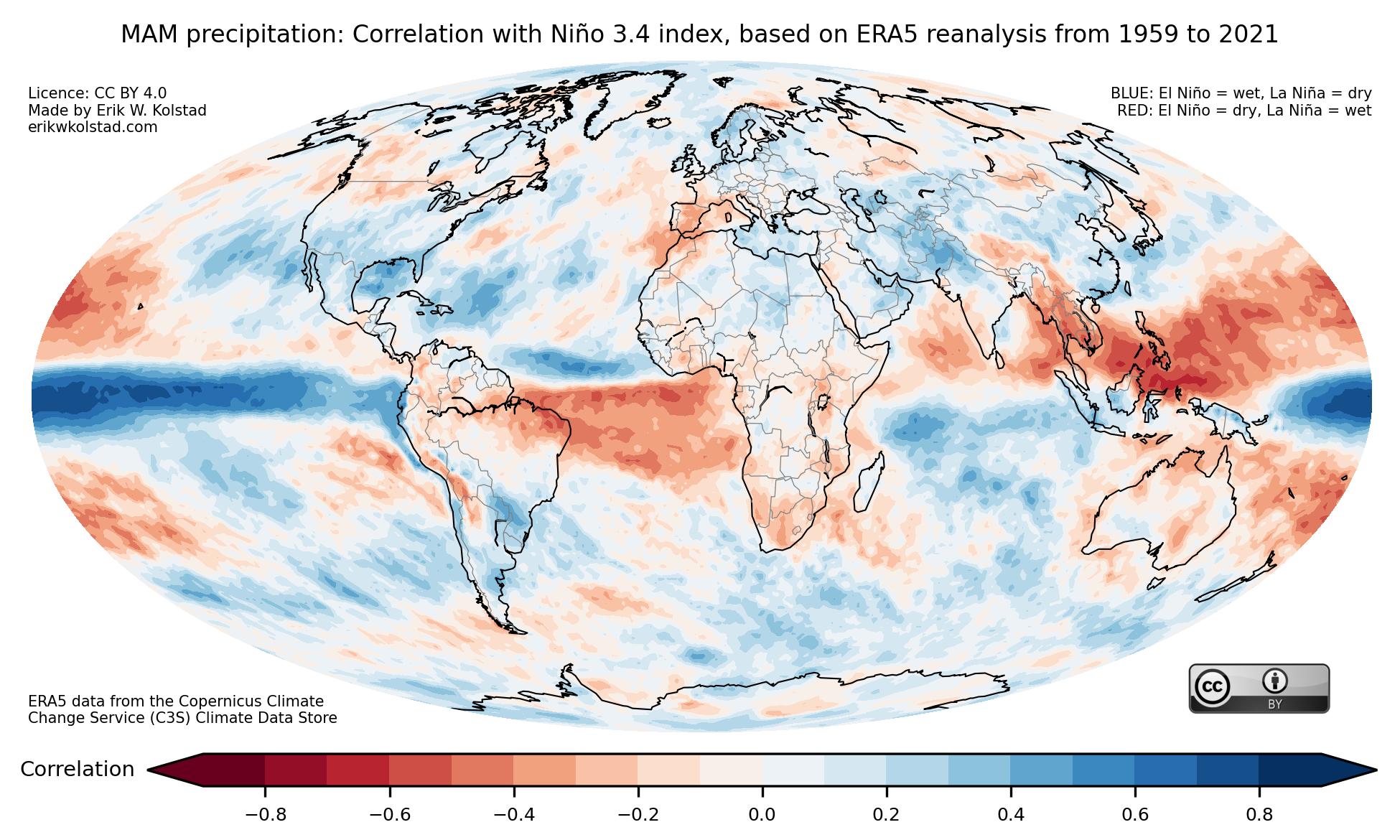
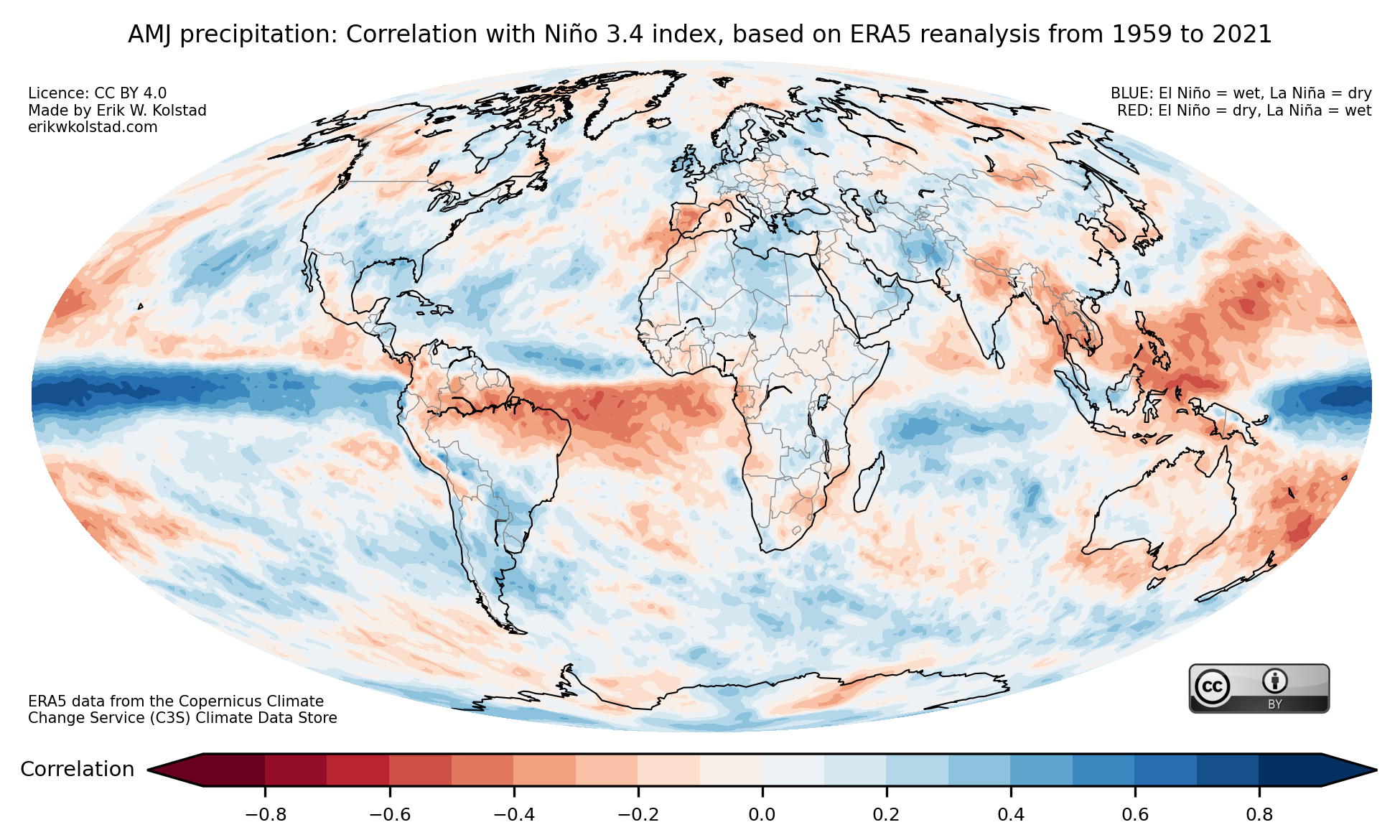
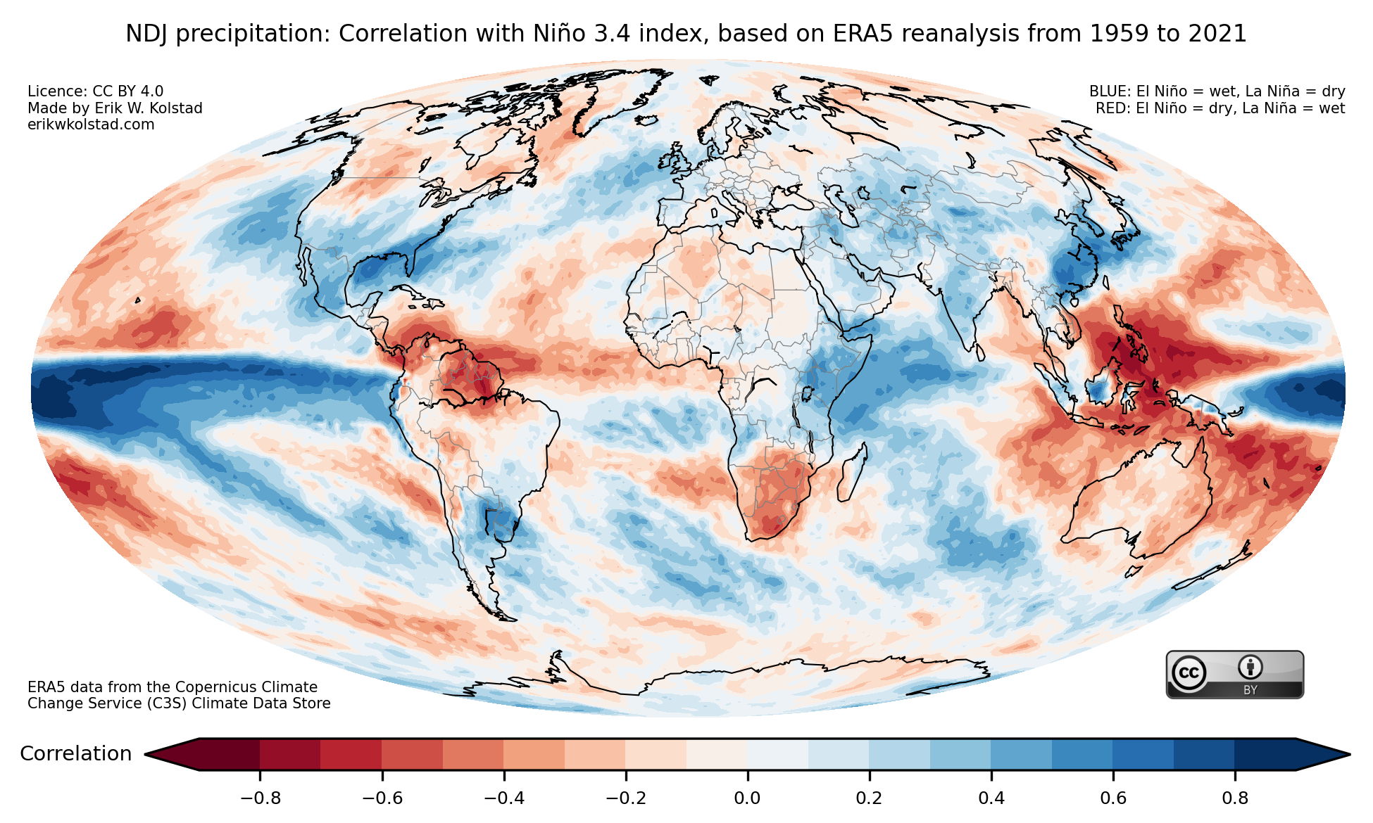
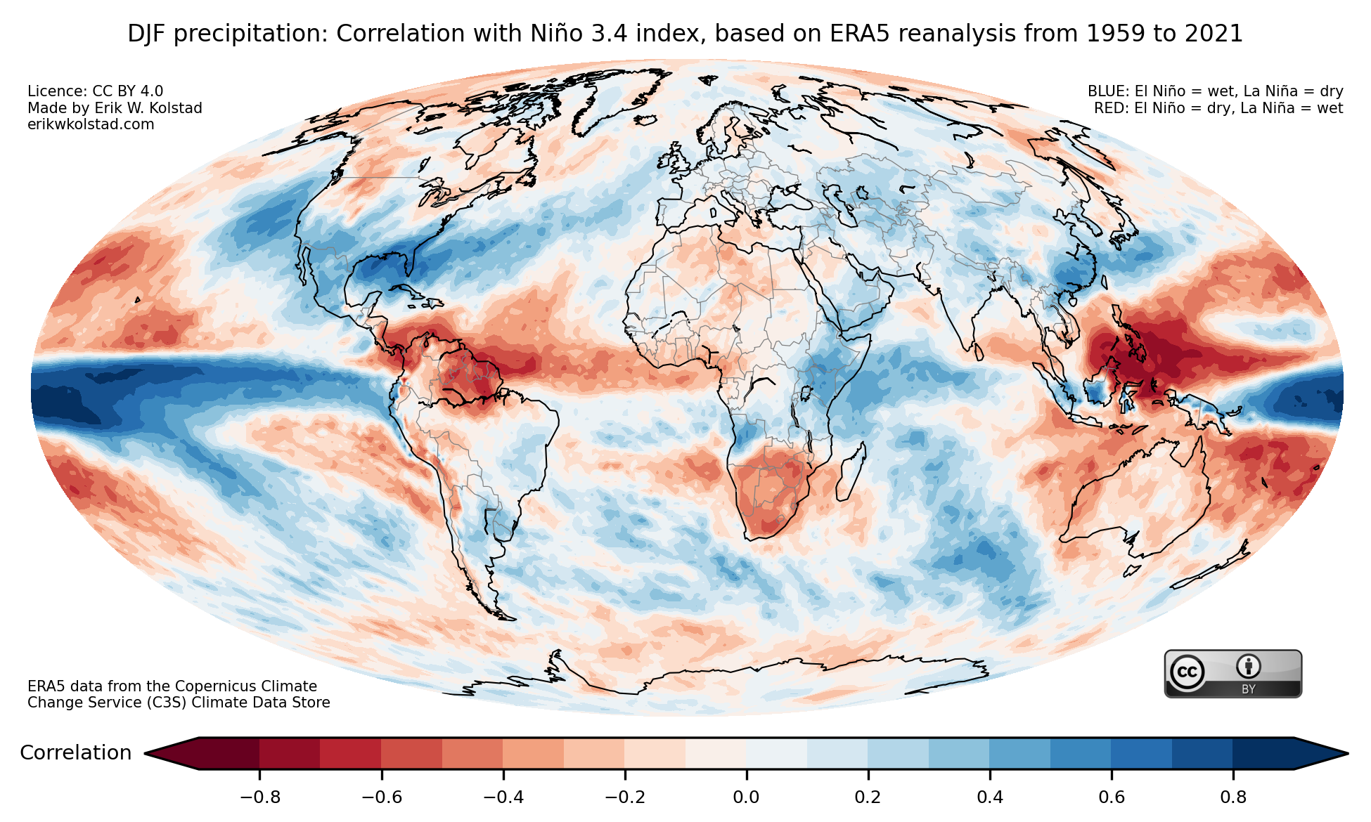
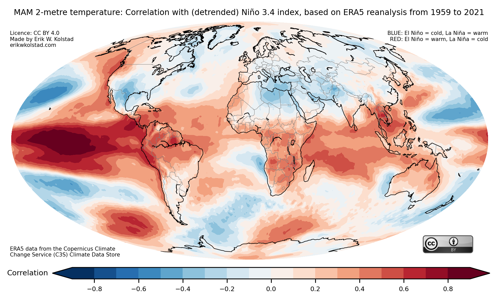
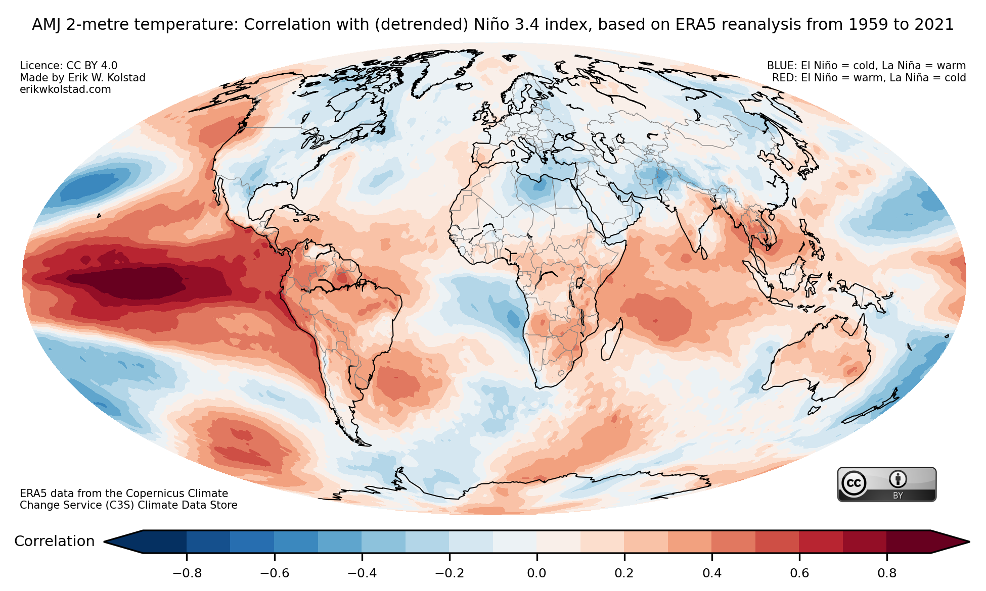
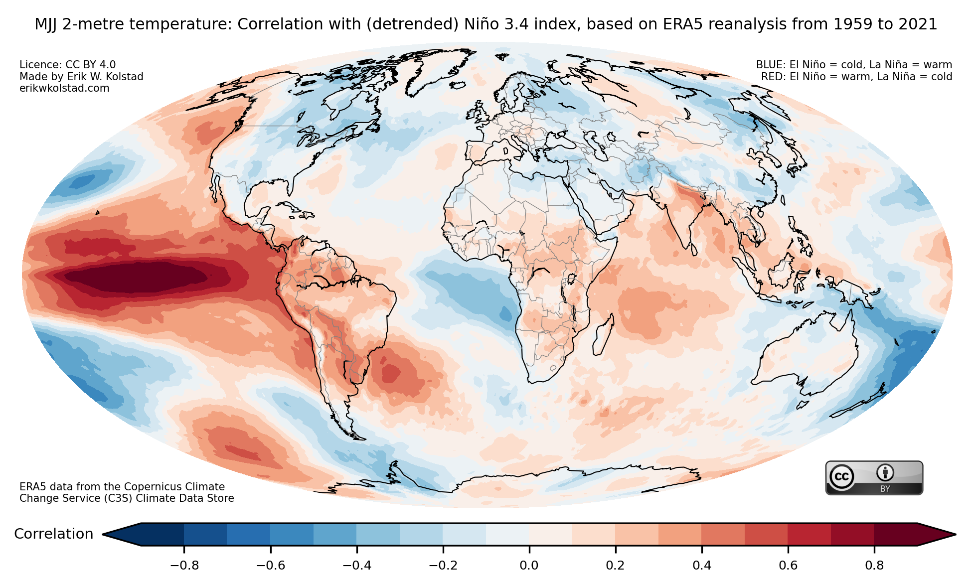
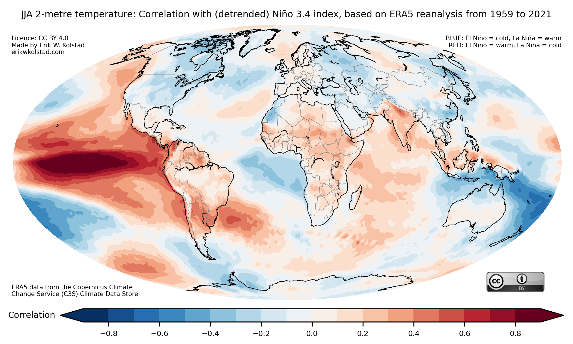
Here is a collection of maps that show the correlation between ENSO (El Niño–Southern Oscillation) and global temperature and precipitation for each possible three-month period, starting with JFM (January–March) and ending with DJF (December–February). The index that I used to represent ENSO (the Niño 3.4 index) is positive when there is an El Niño and negative during La Niña episodes.
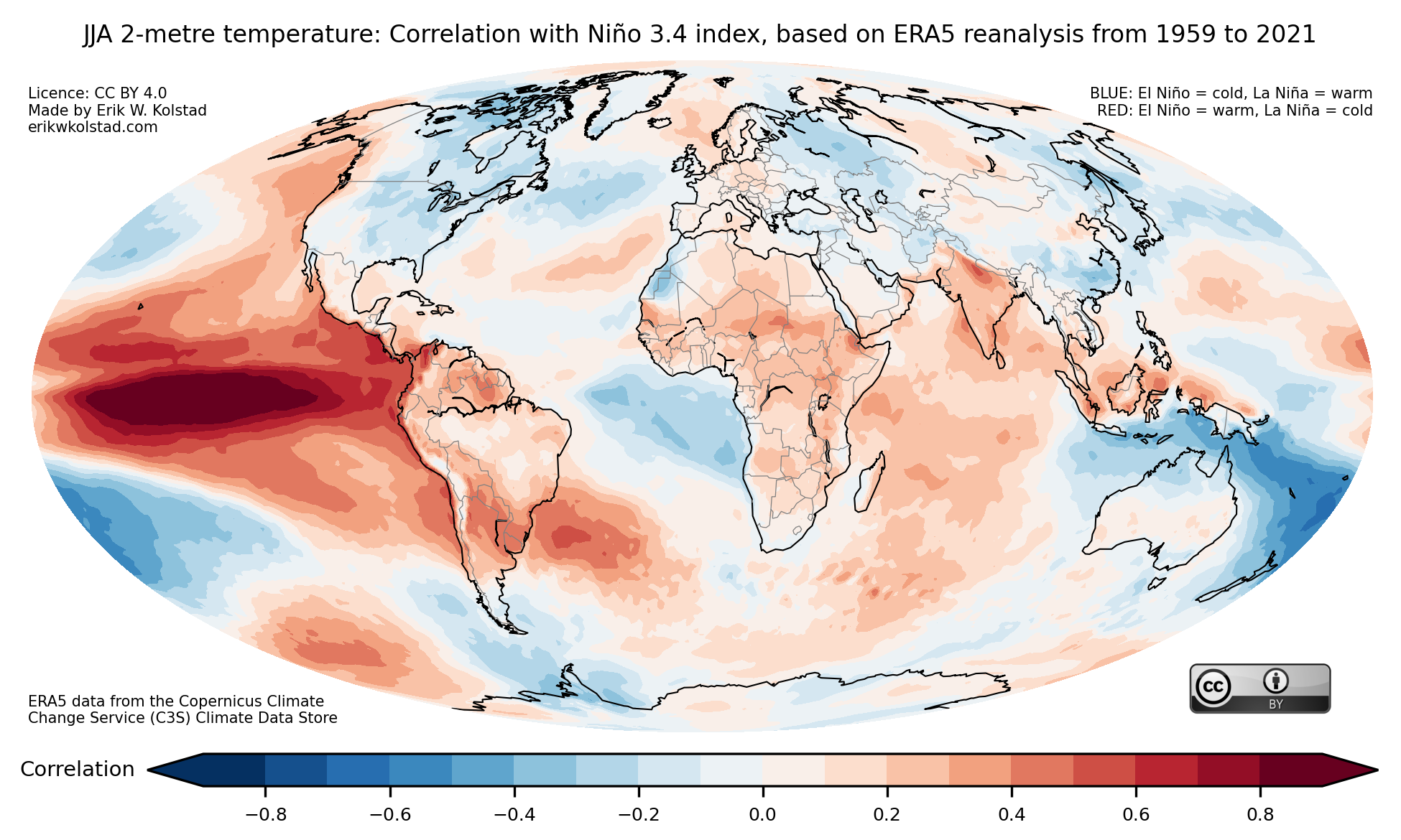
Let’s look at one example first, the boreal summer from June to August (abbreviated JJA). Here’s the map that shows the correlation with temperature:

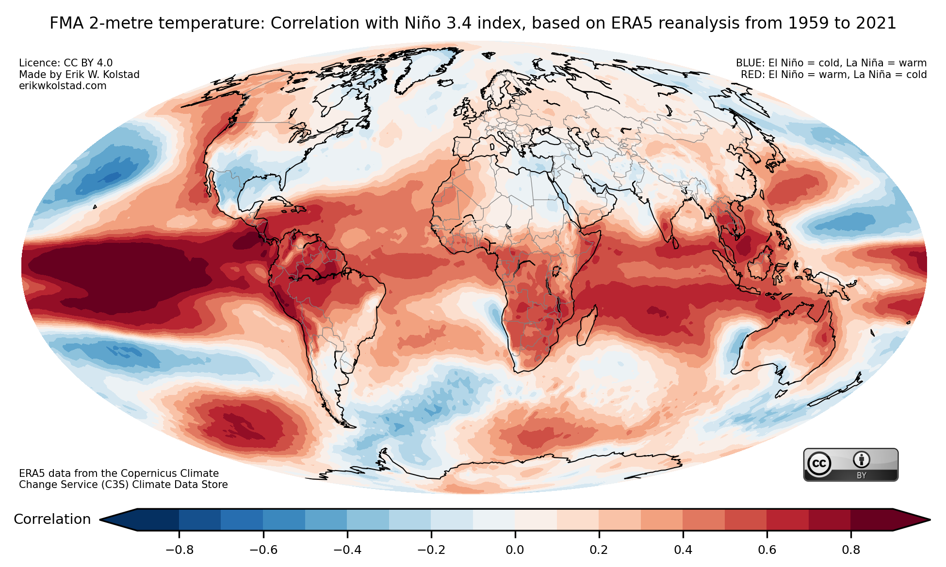
The red areas are warmer than normal when there is an active El Niño and colder than normal when during La Niña episodes, where «normal» means the 1959–2021 average. It is no surprise that the eastern part of the Equatorial Pacific is red on the map, as the definition of El Niño is that the ocean surface in this region is warmer than normal. The correlations in Europe are slightly positive, while in the east part of North America they are negative.
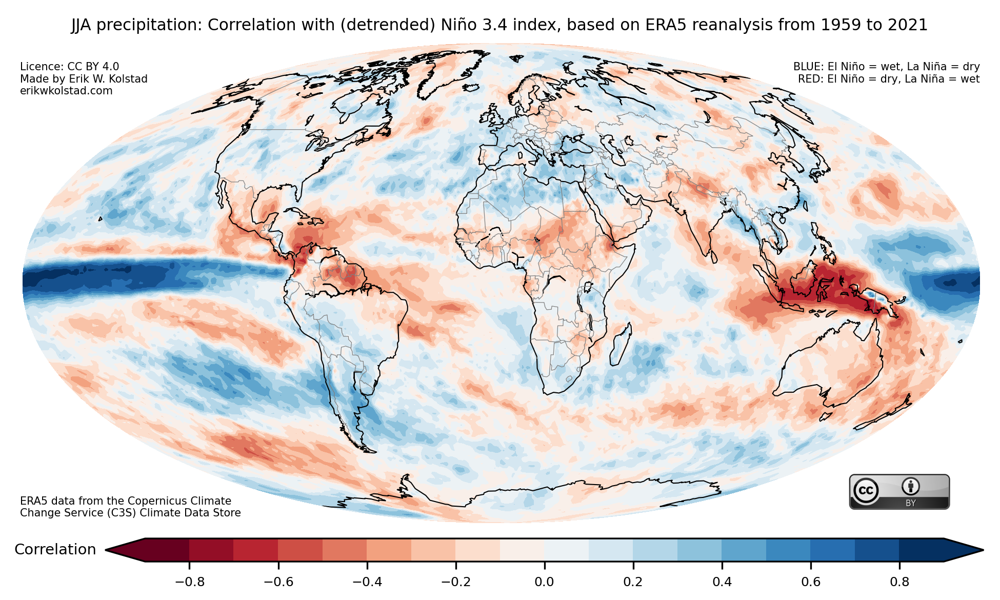
Here’s the corresponding map for precipitation (rainfall):

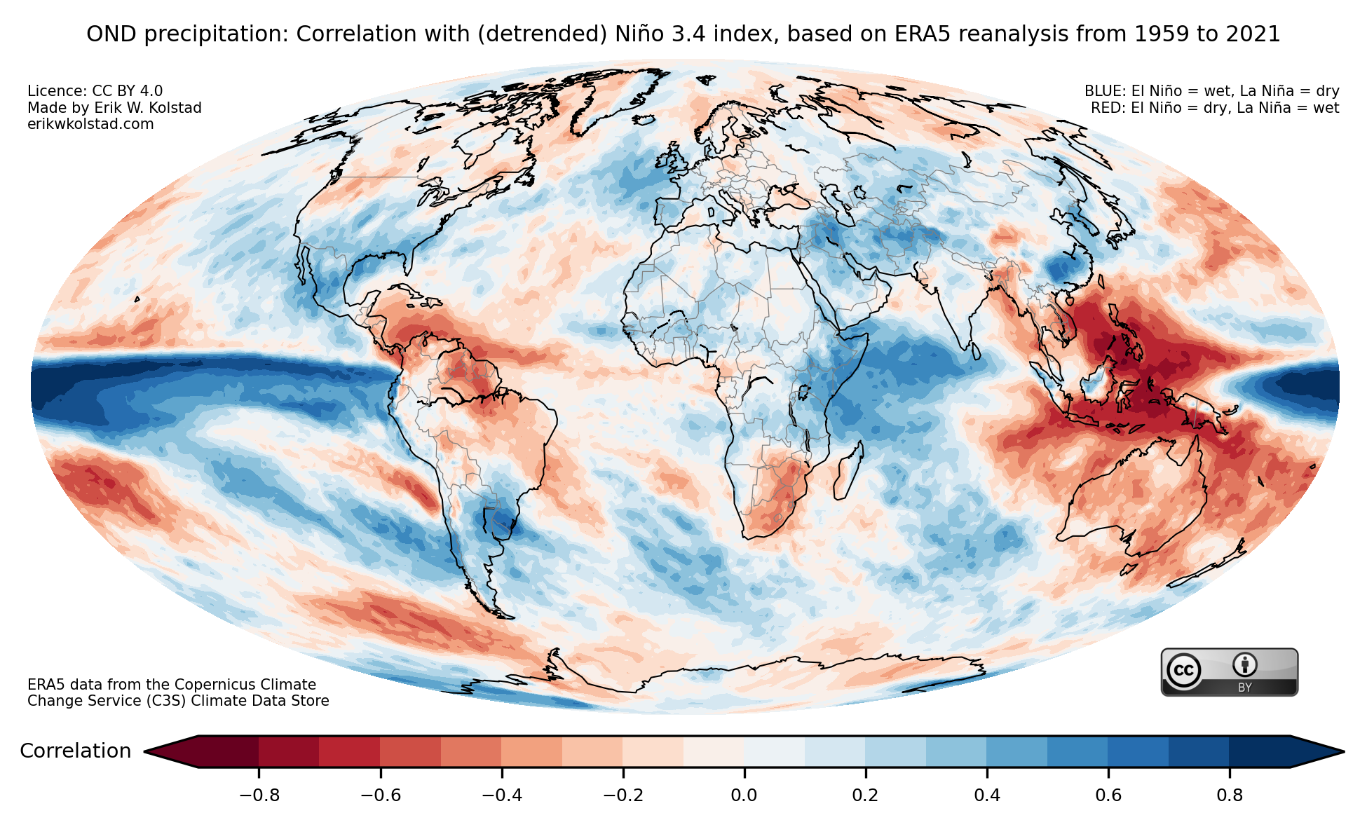
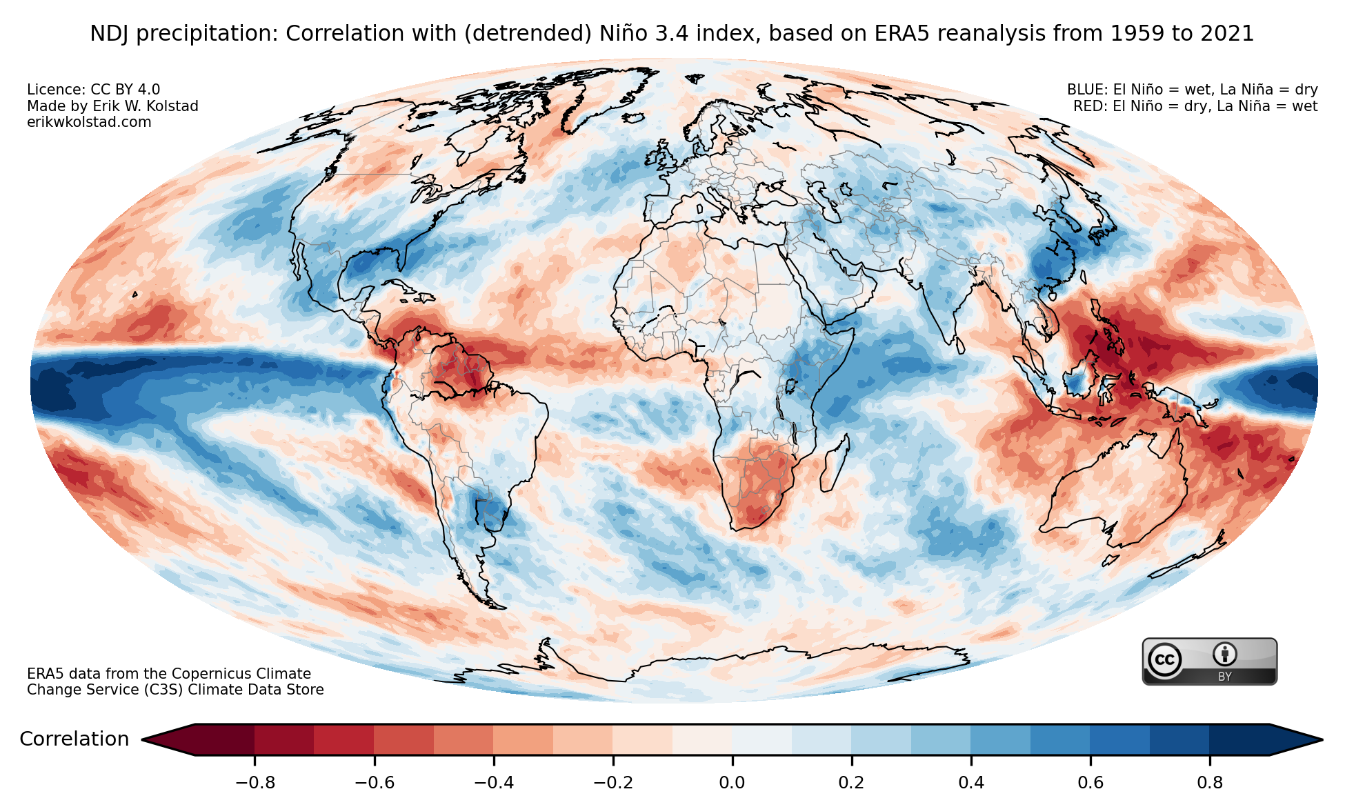
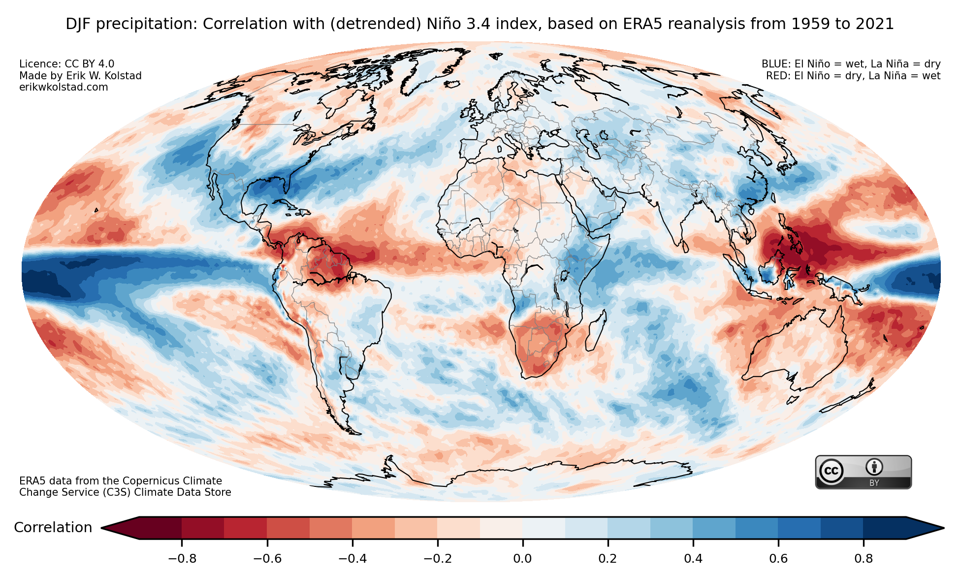
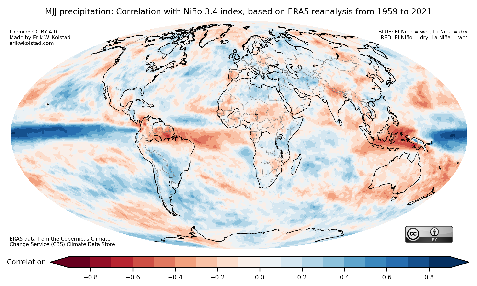
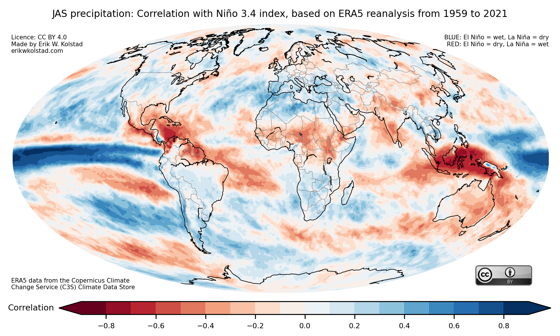
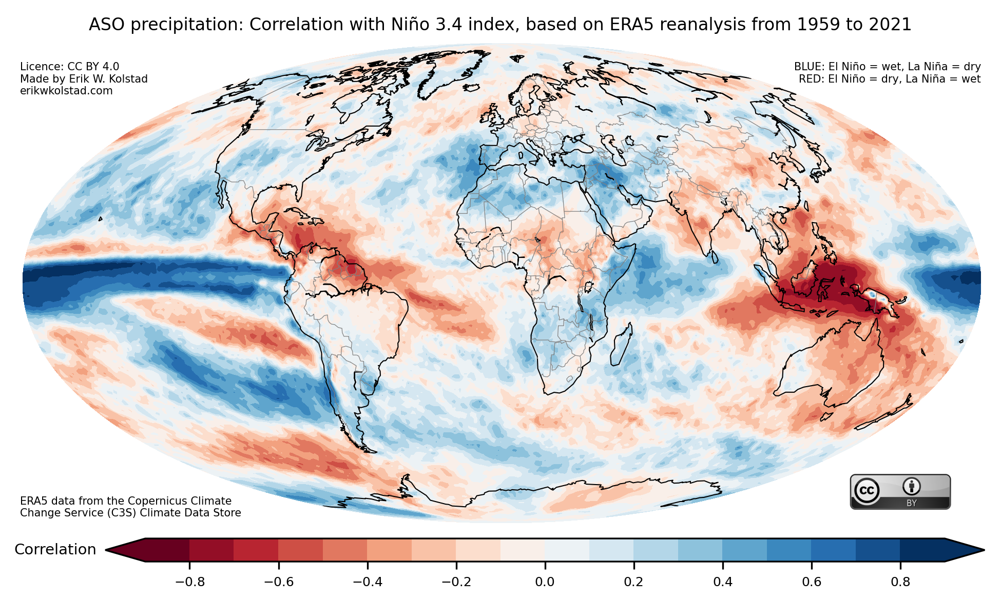
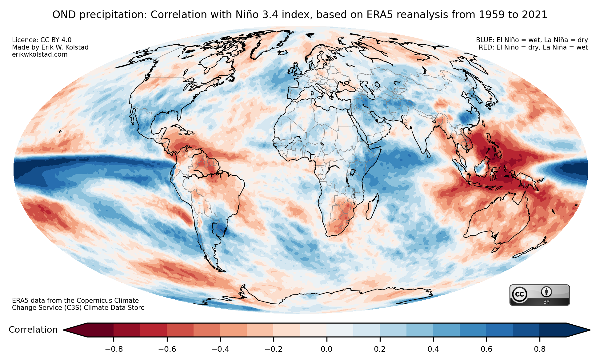
Some areas stand out as drier-than-normal during El Niños, such as Central America and the northern part of North America, Australia, Indonesia, and Equatorial Africa, and other areas are usually wetter-than-normal, including North Africa, CONUS (the contiguous United States), large parts of South America, western Europe, and South Africa.
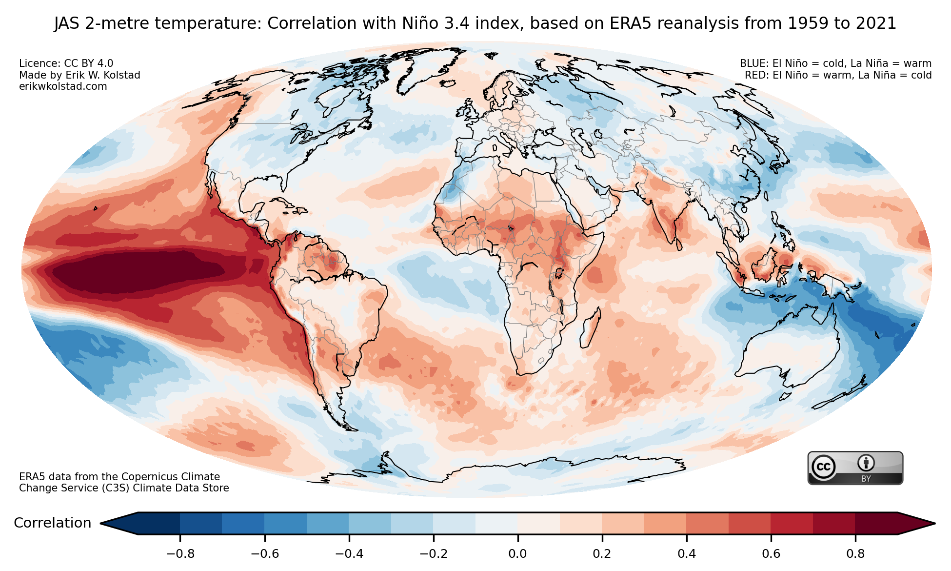
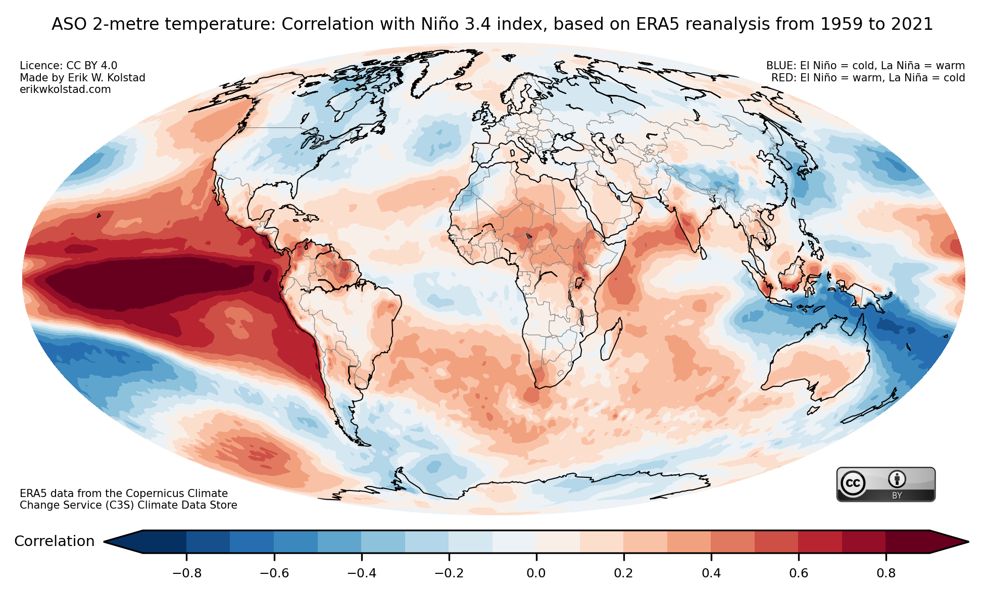
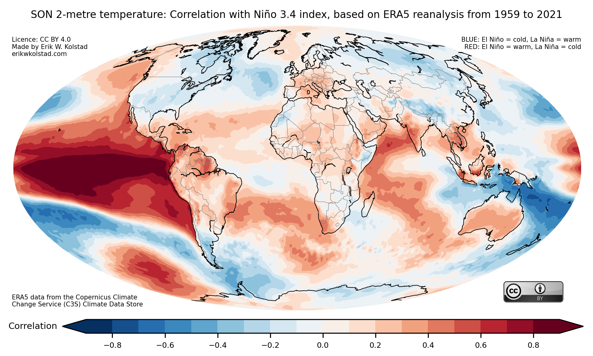
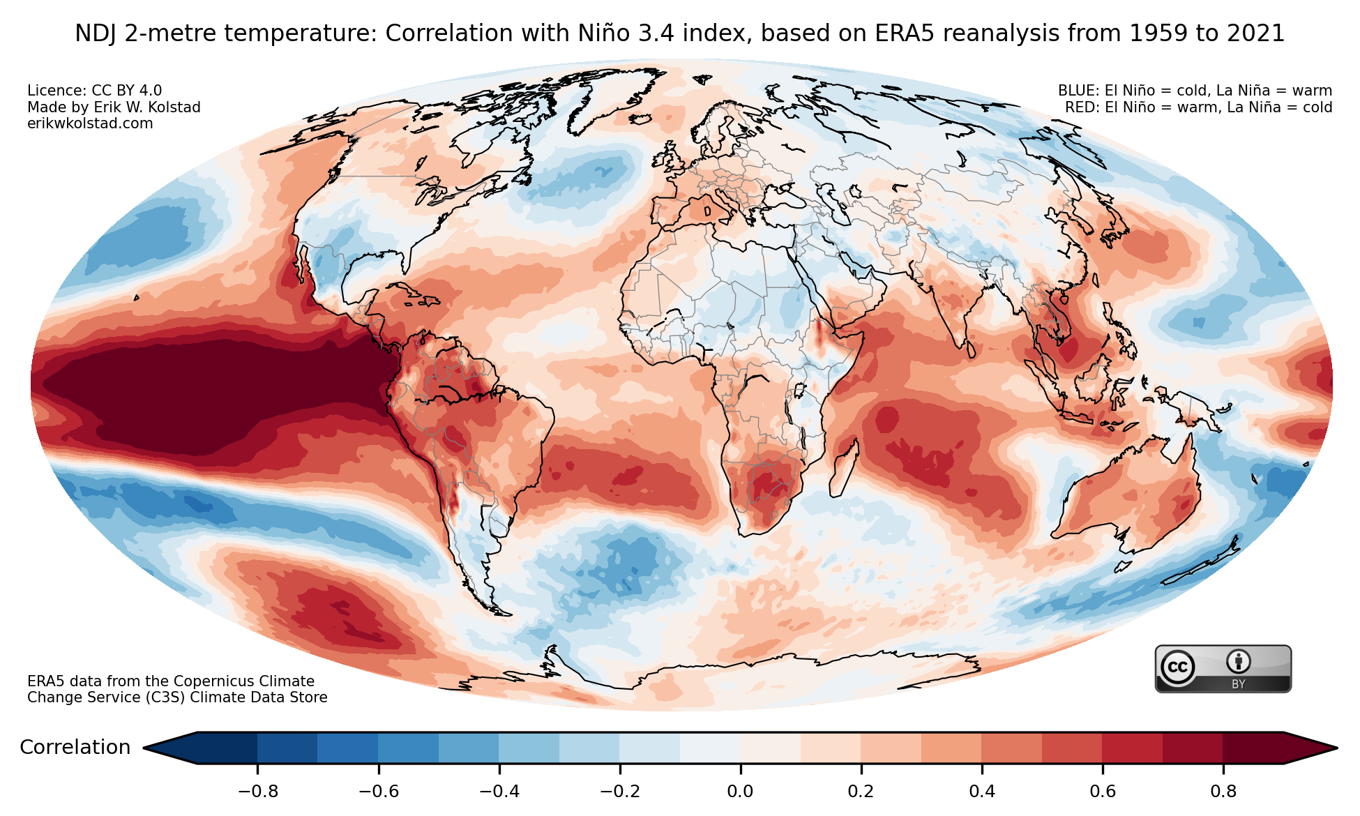
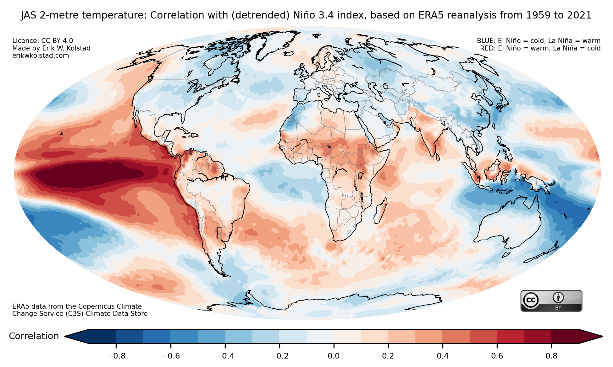
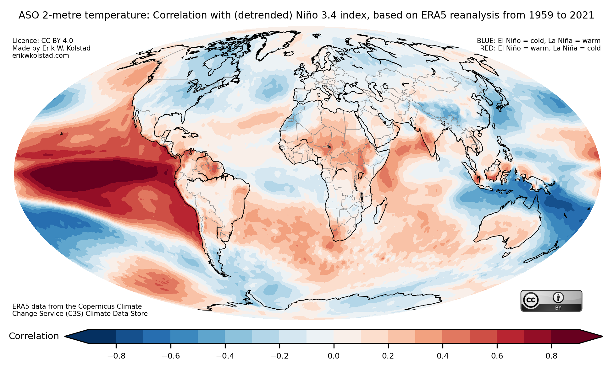
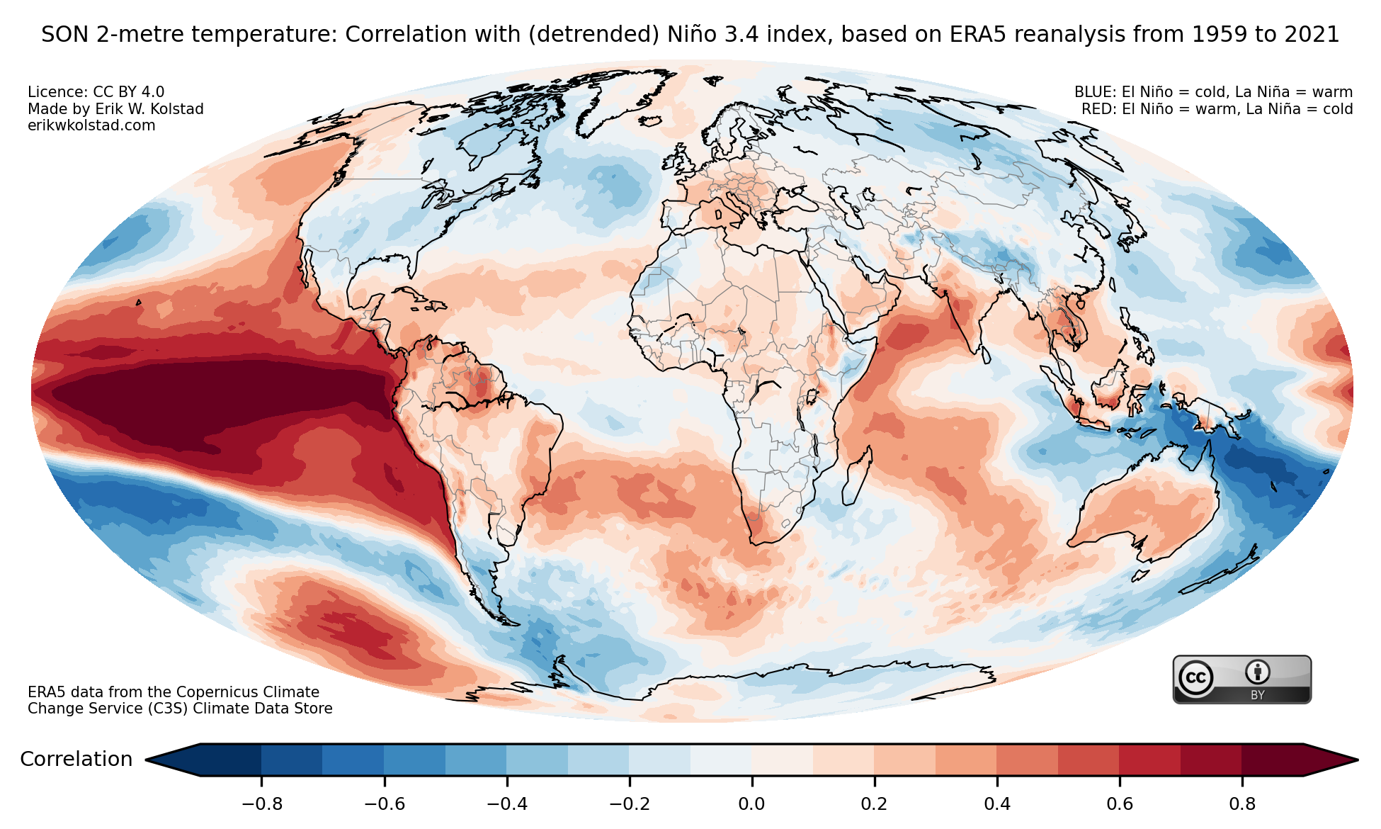
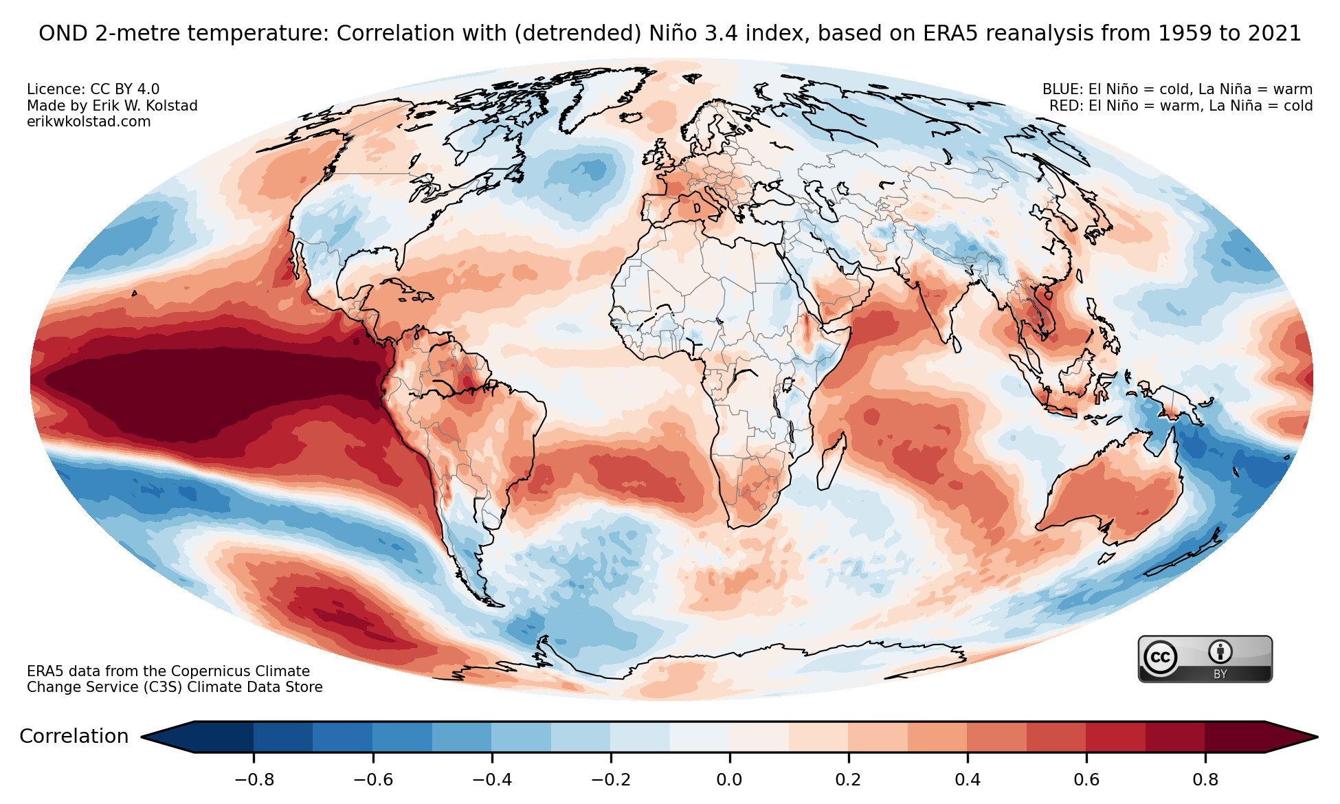
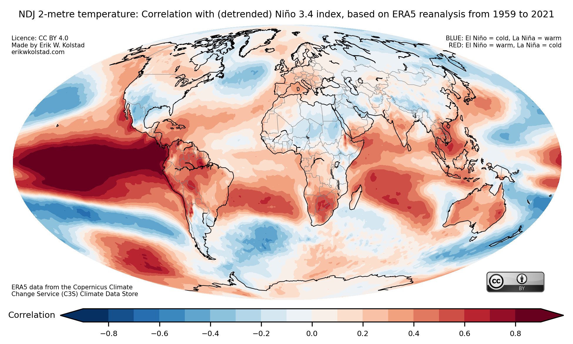
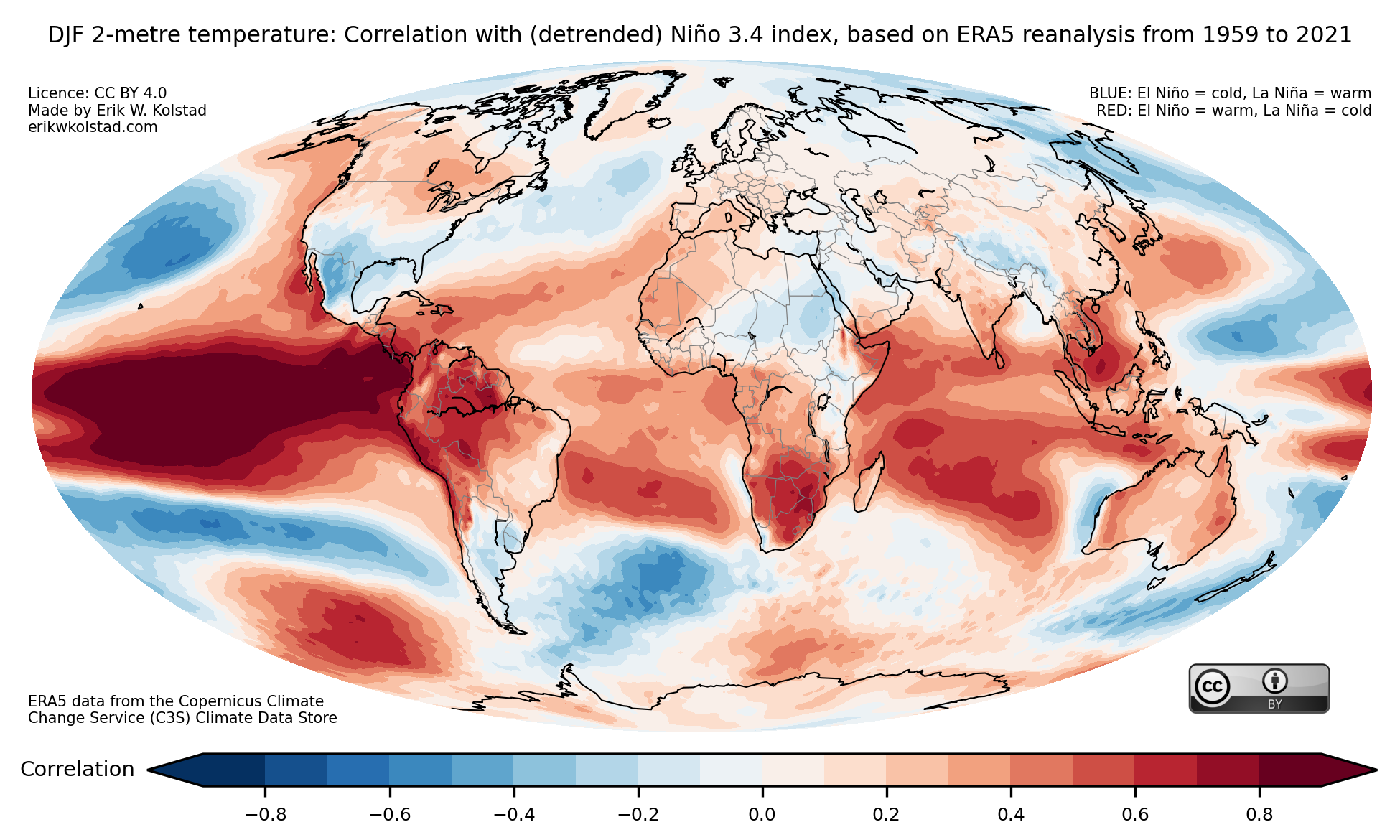
In the gallery below, you’ll find the temperature correlation maps for all 12 three-month periods.


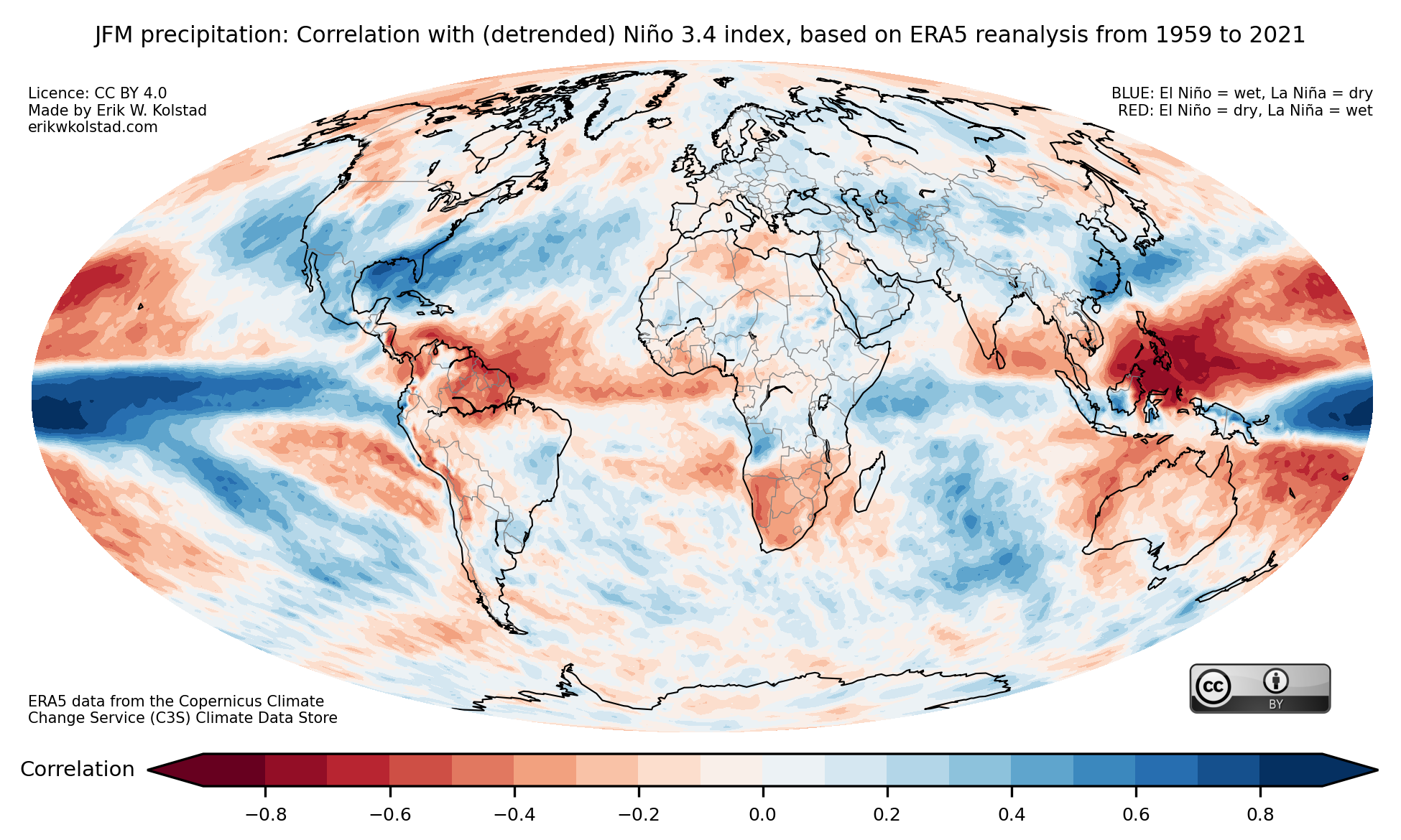
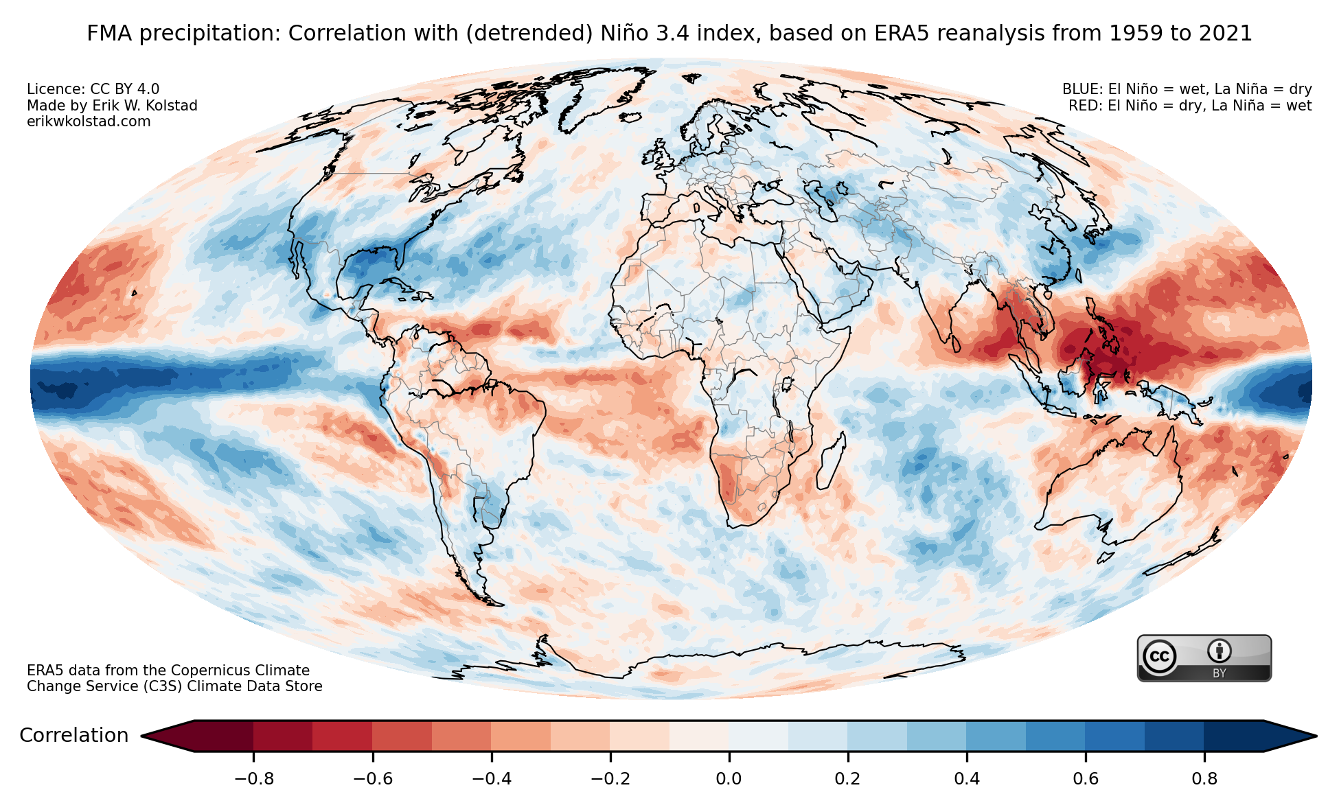
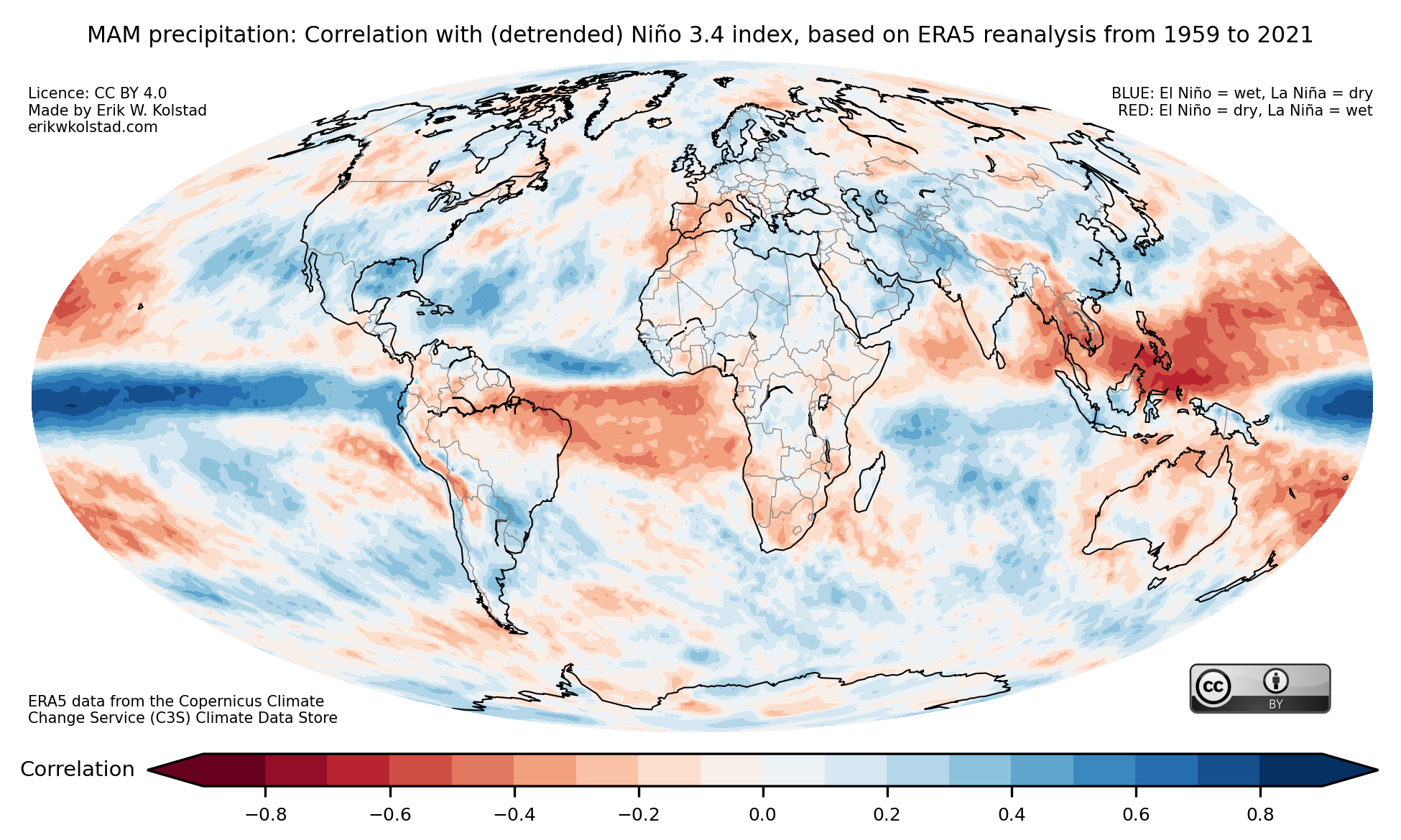
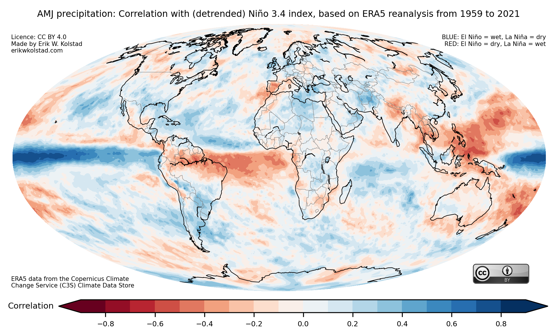
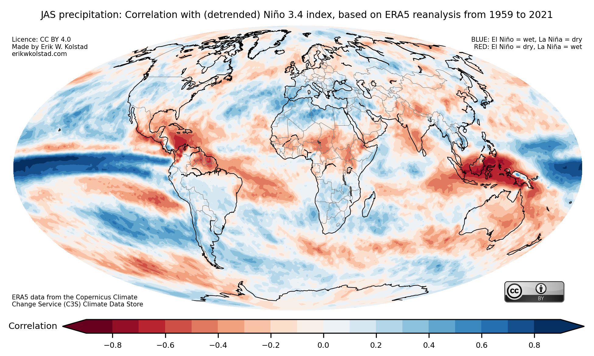
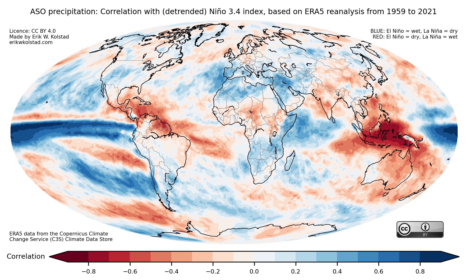
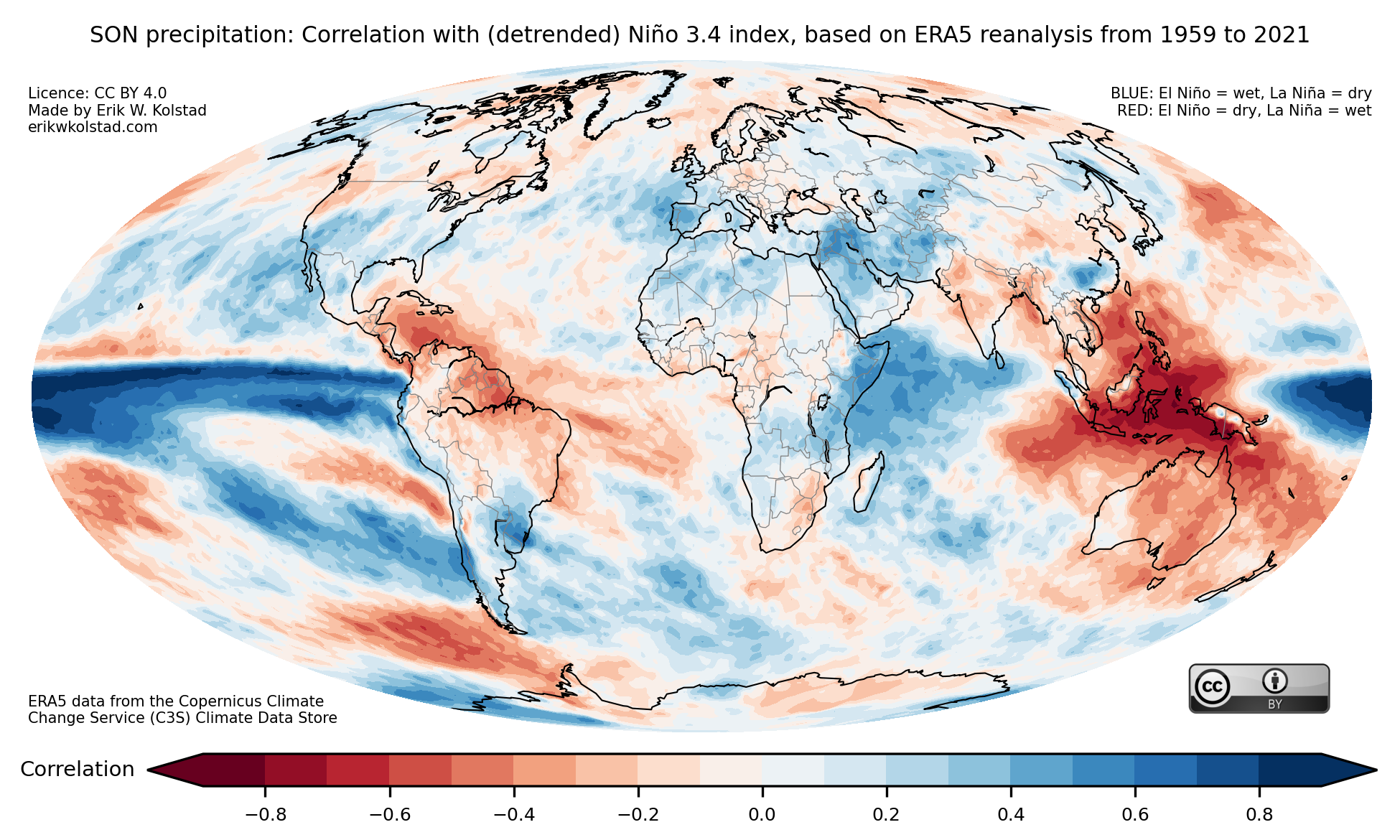
The gallery below shows the precipitation correlation maps for all three-month periods:


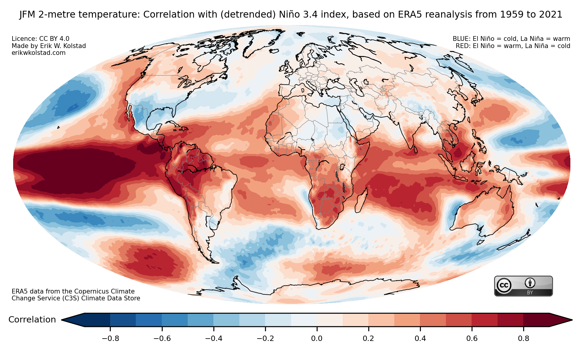
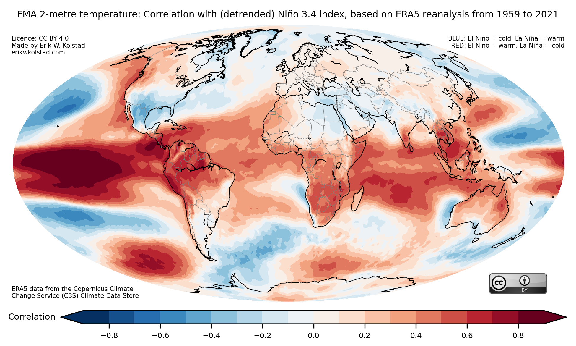
A final comment is that one should be conscious that some of the correlation is due to the substantial trends during the period shown. I’m therefore including figures based on linearly detrended data (although it doesn’t make a huge difference). Temperature first:
And finally precipitation: