Update on 20 May 2026: Added maps for sea level pressure, thanks to a suggestion by Scott Osprey
About three years ago, I made some maps illustrating the global relationships between El Niño/La Niña and temperature and precipitation. These have turned out to be quite popular, so I updated them (and added maps for sea level pressure) using data up to February 2026. I also detrended the data, i.e. removed the linear trend over the period (see the brief methodology section at the bottom of this post for more details).
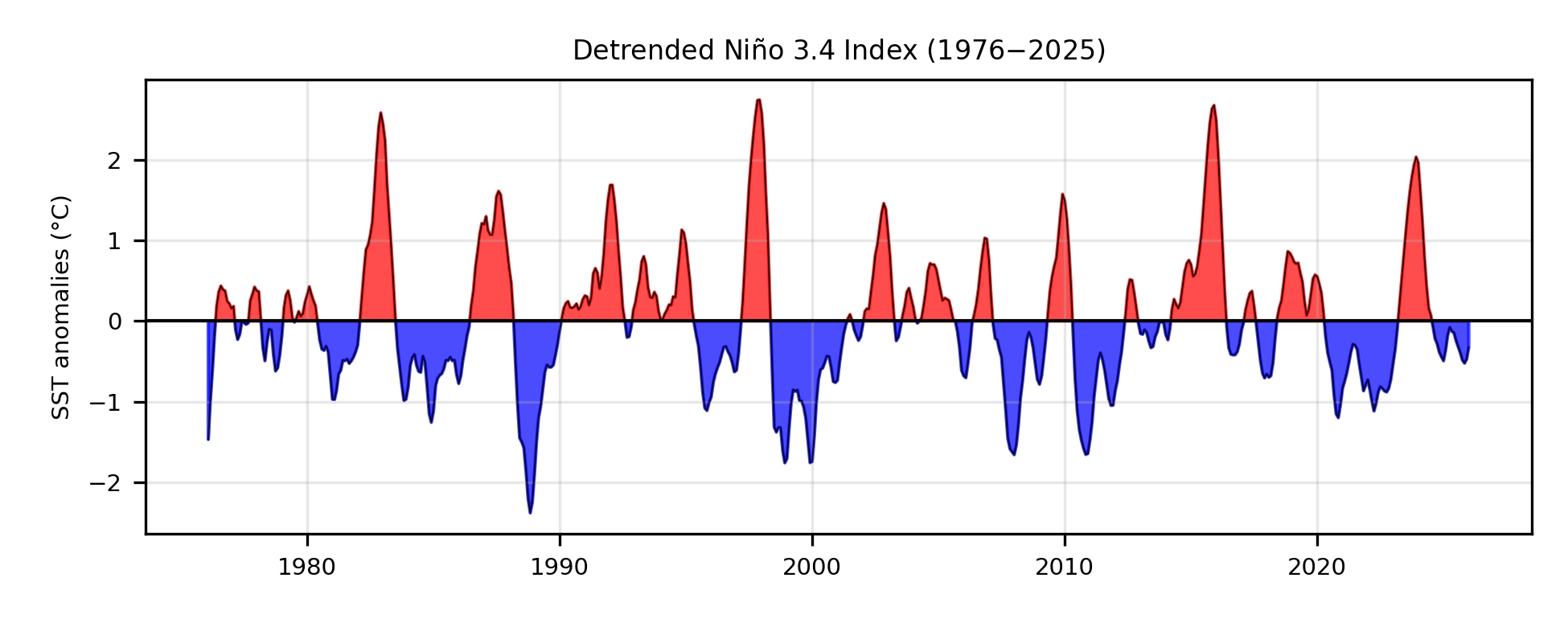
First, here’s the time series of the Niño 3.4 index for each centred three-month window starting in February 1976 up until January 2026:
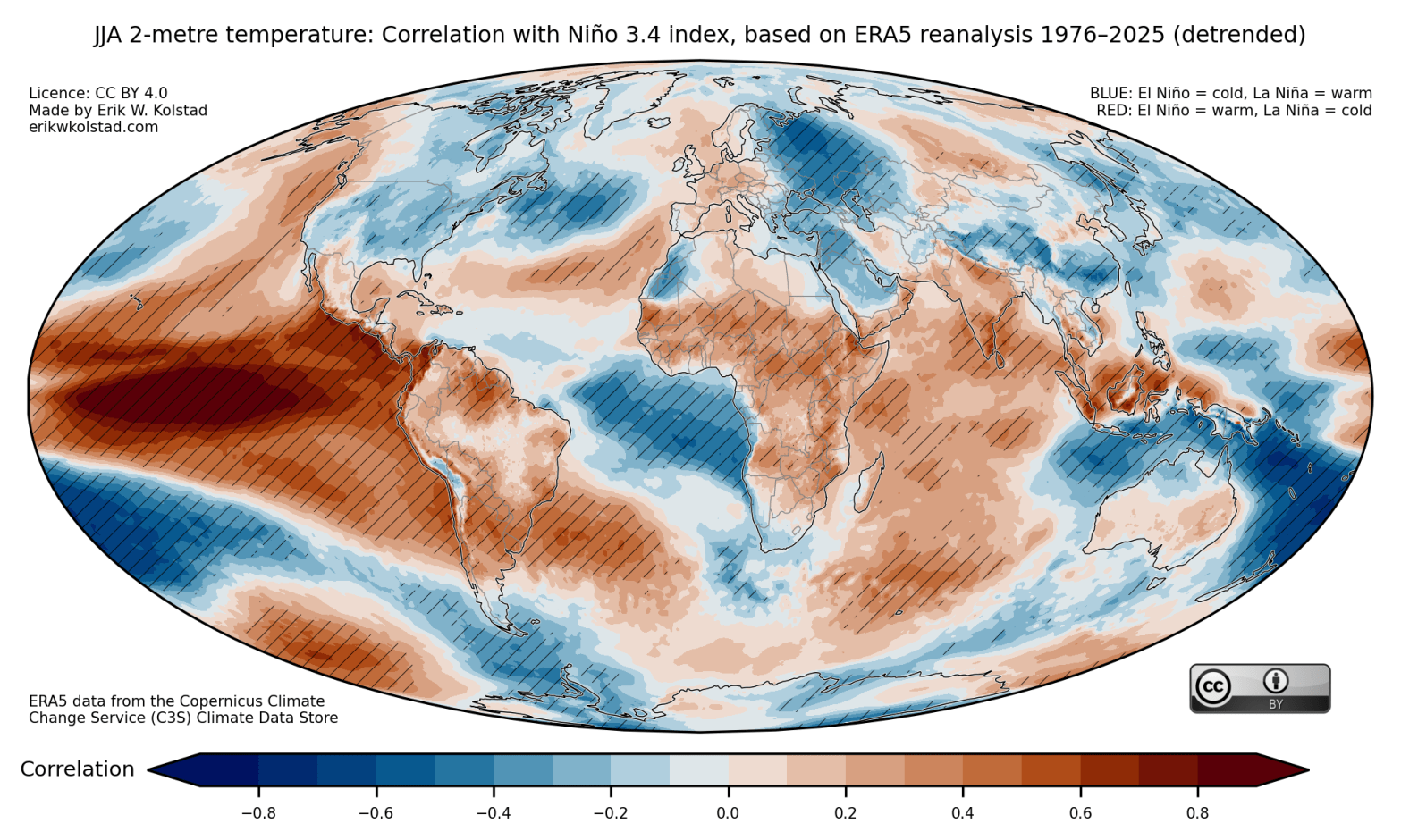
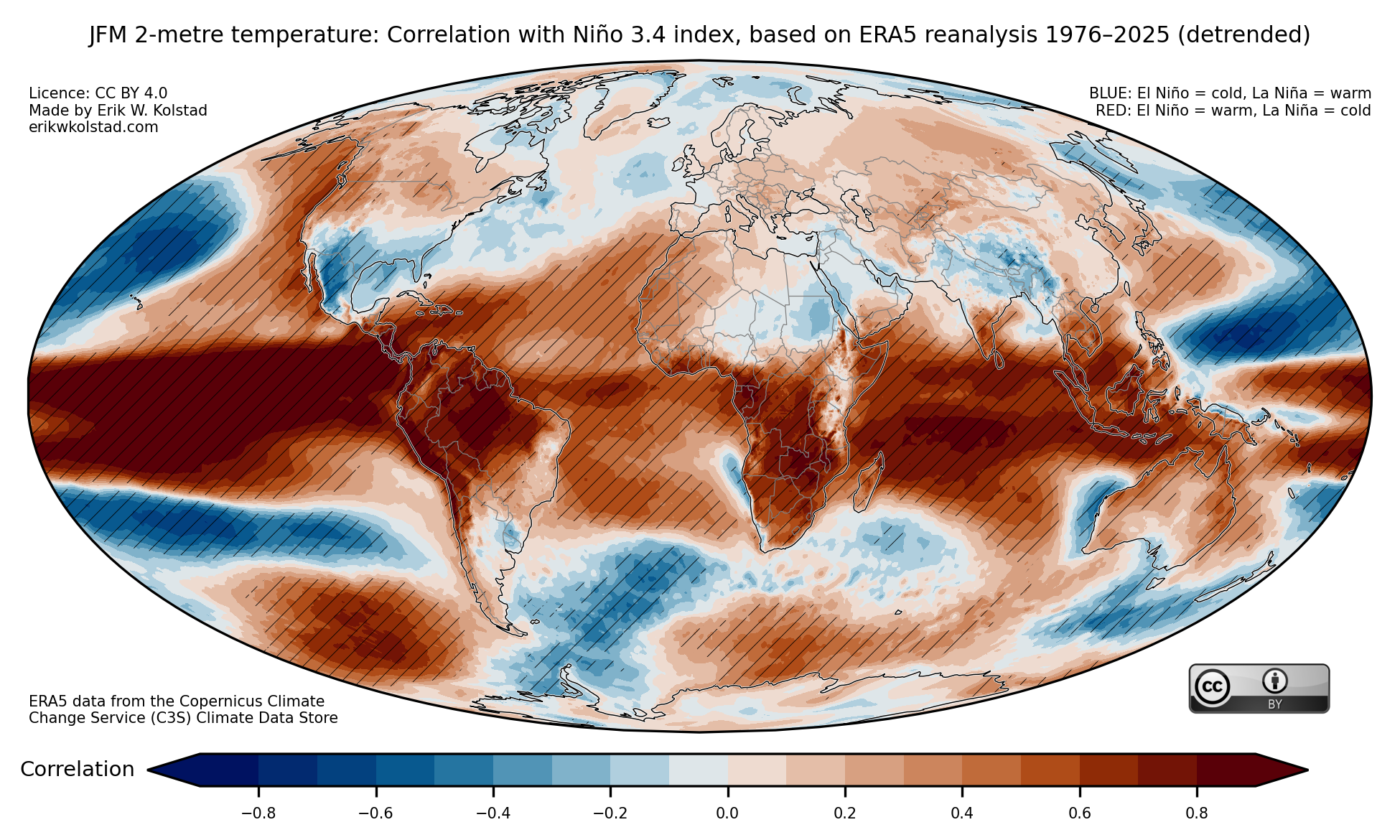
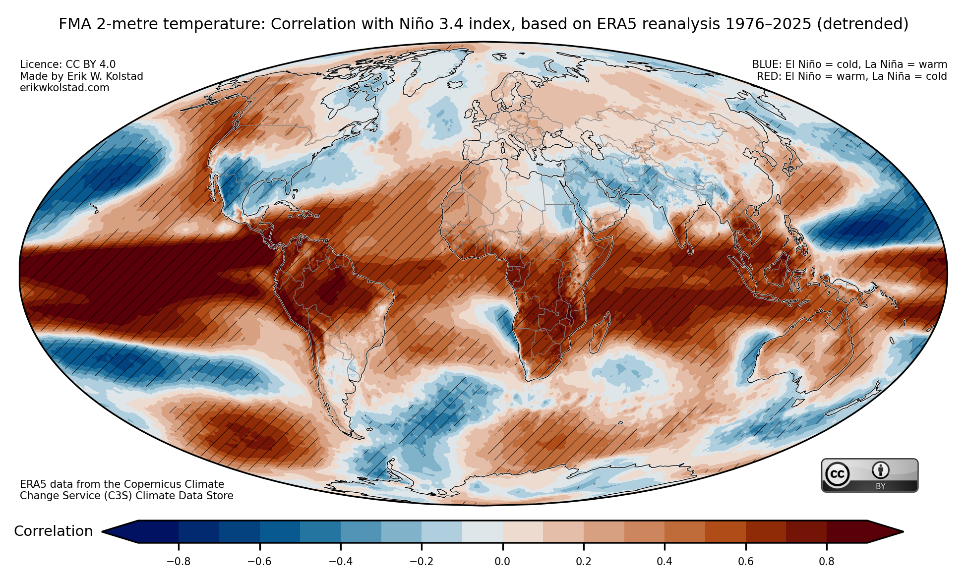
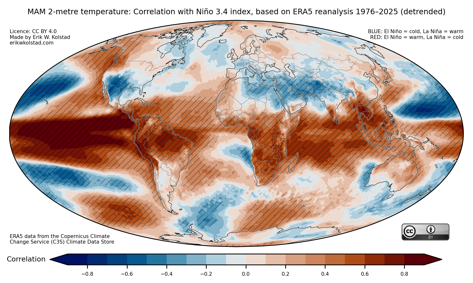
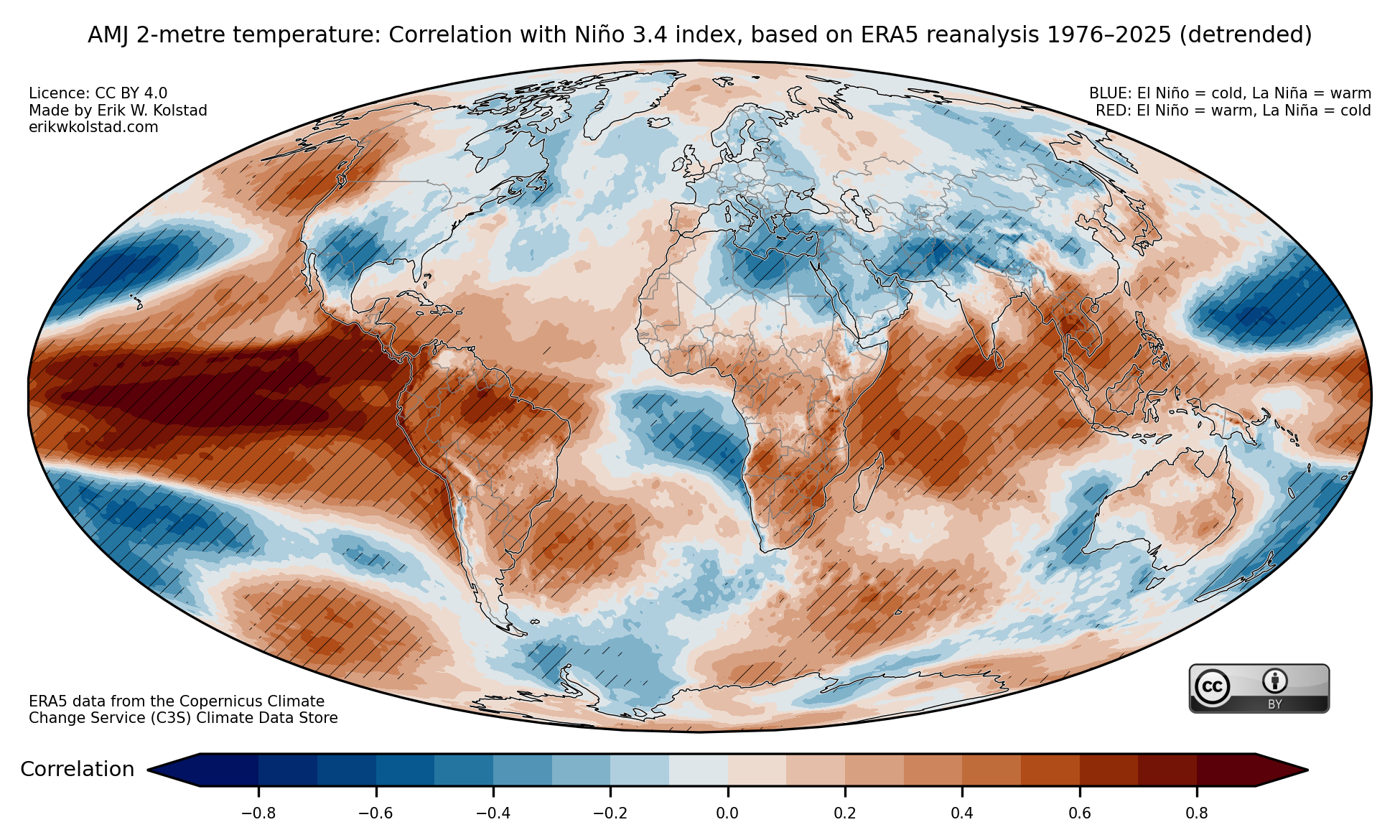
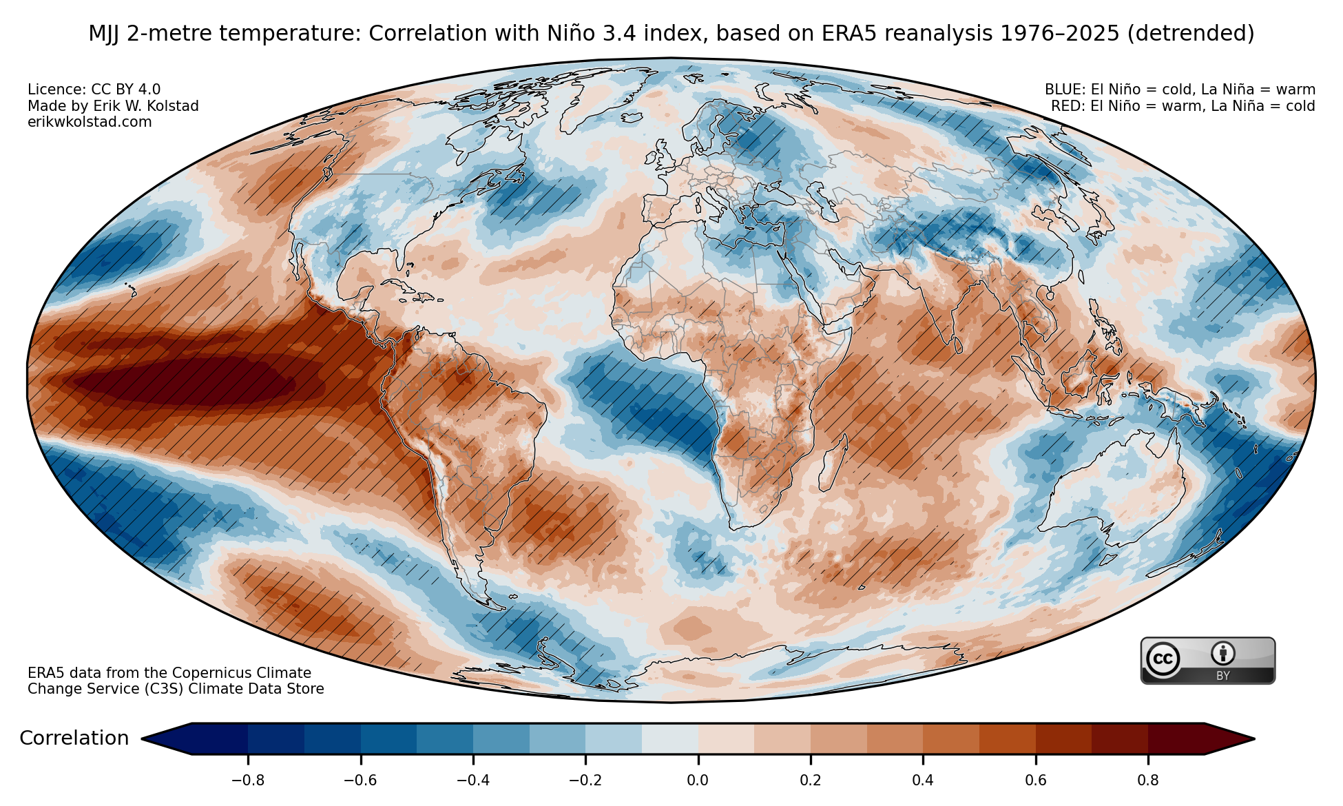
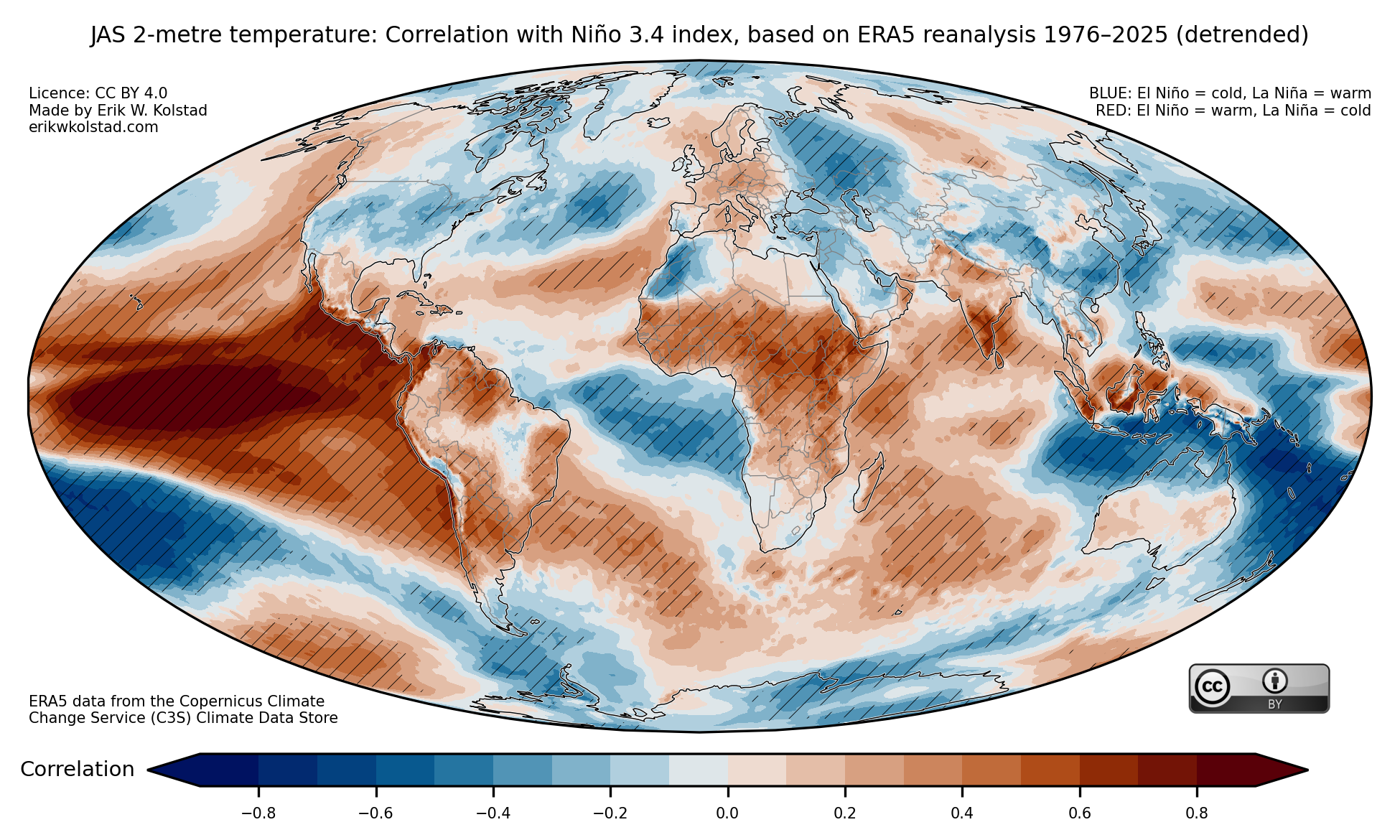
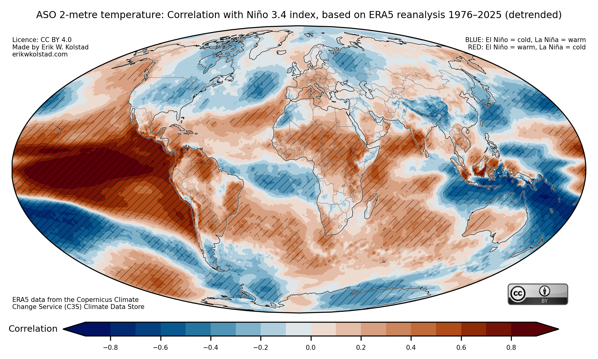
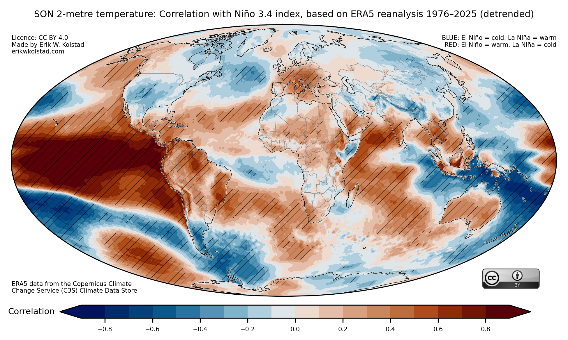
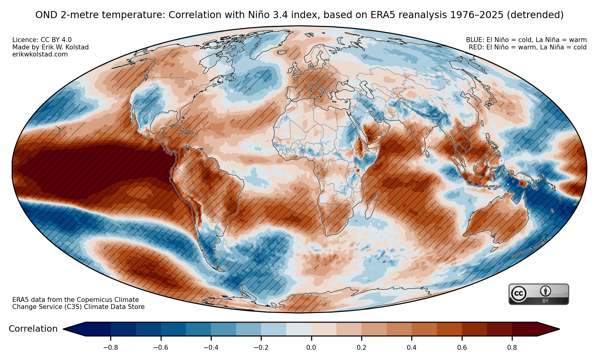
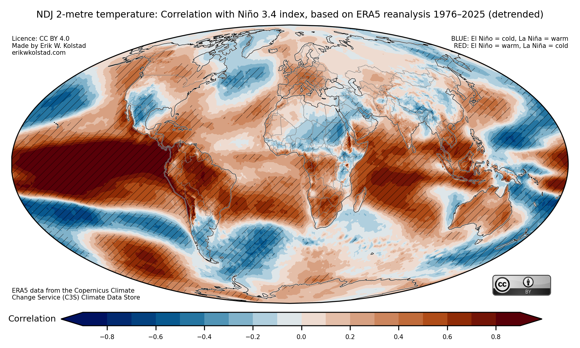
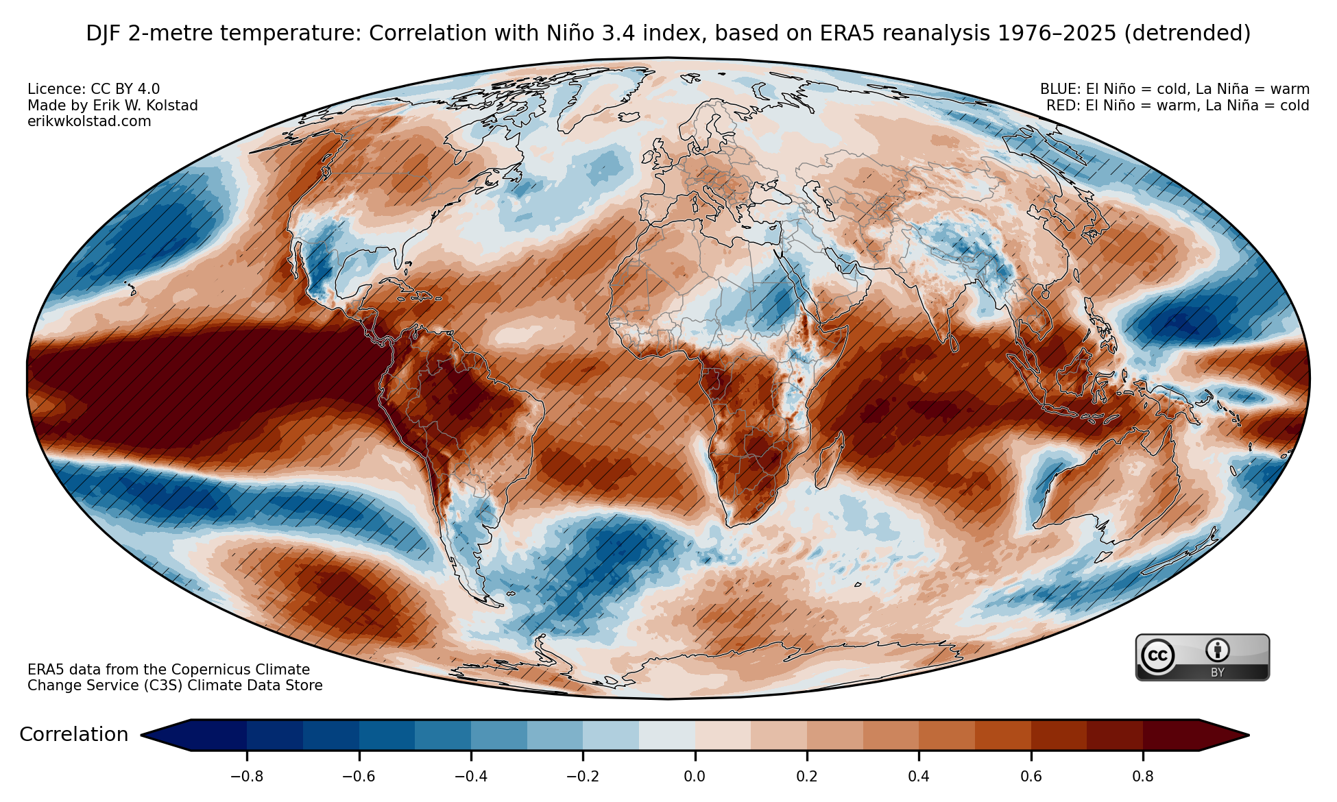
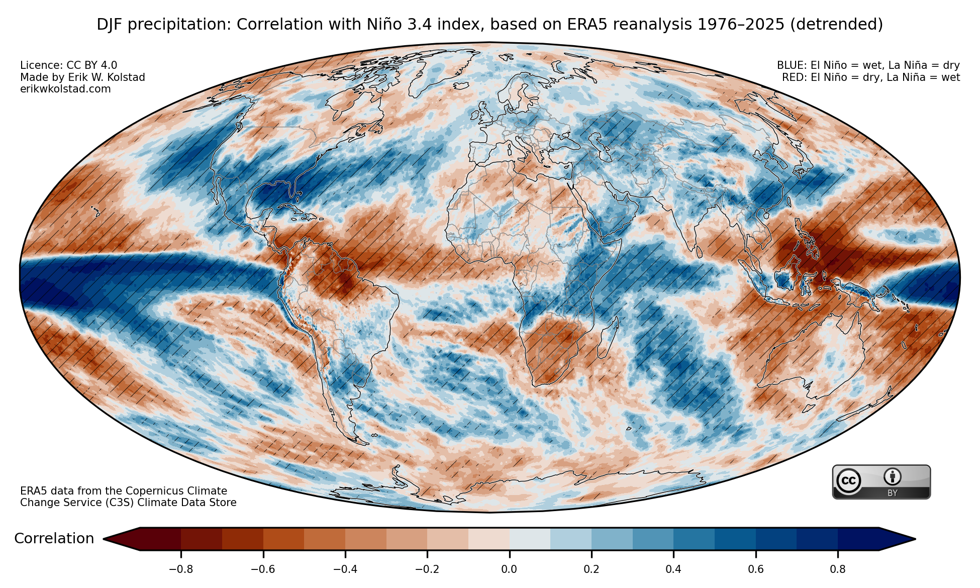
In the gallery below, I show the interannual correlation between seasonal (3-monthly) mean temperature and the Niño 3.4 index for all three-month periods. The first picture below shows the concurrent correlations for January–March, and the last one shows them for December–February. The hatching indicates where the correlations are significant. By clicking on one of the pictures, you can navigate back and forth between seasons.

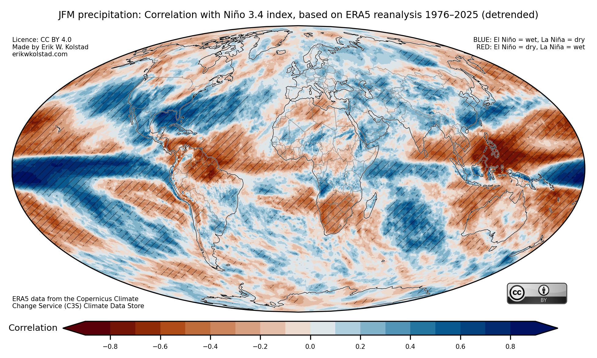
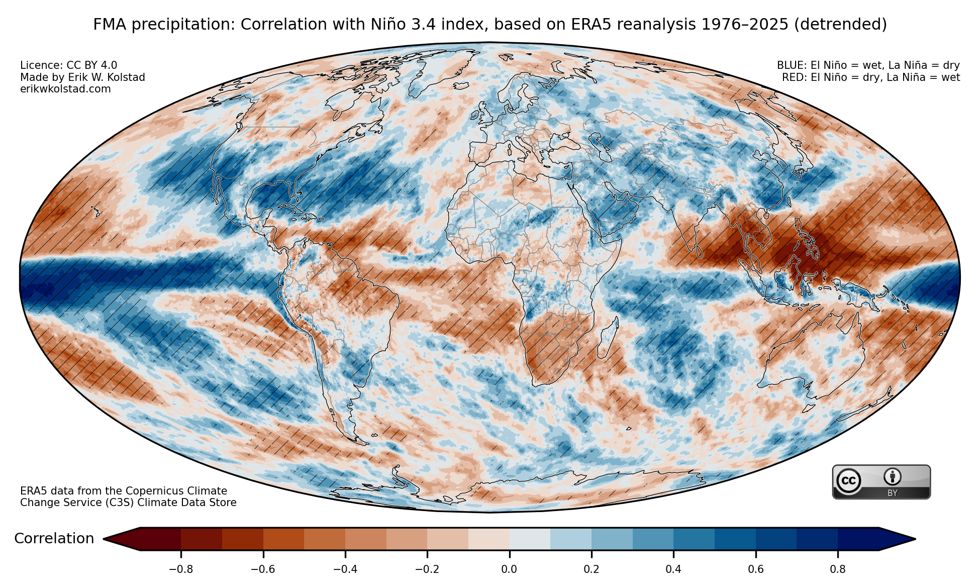
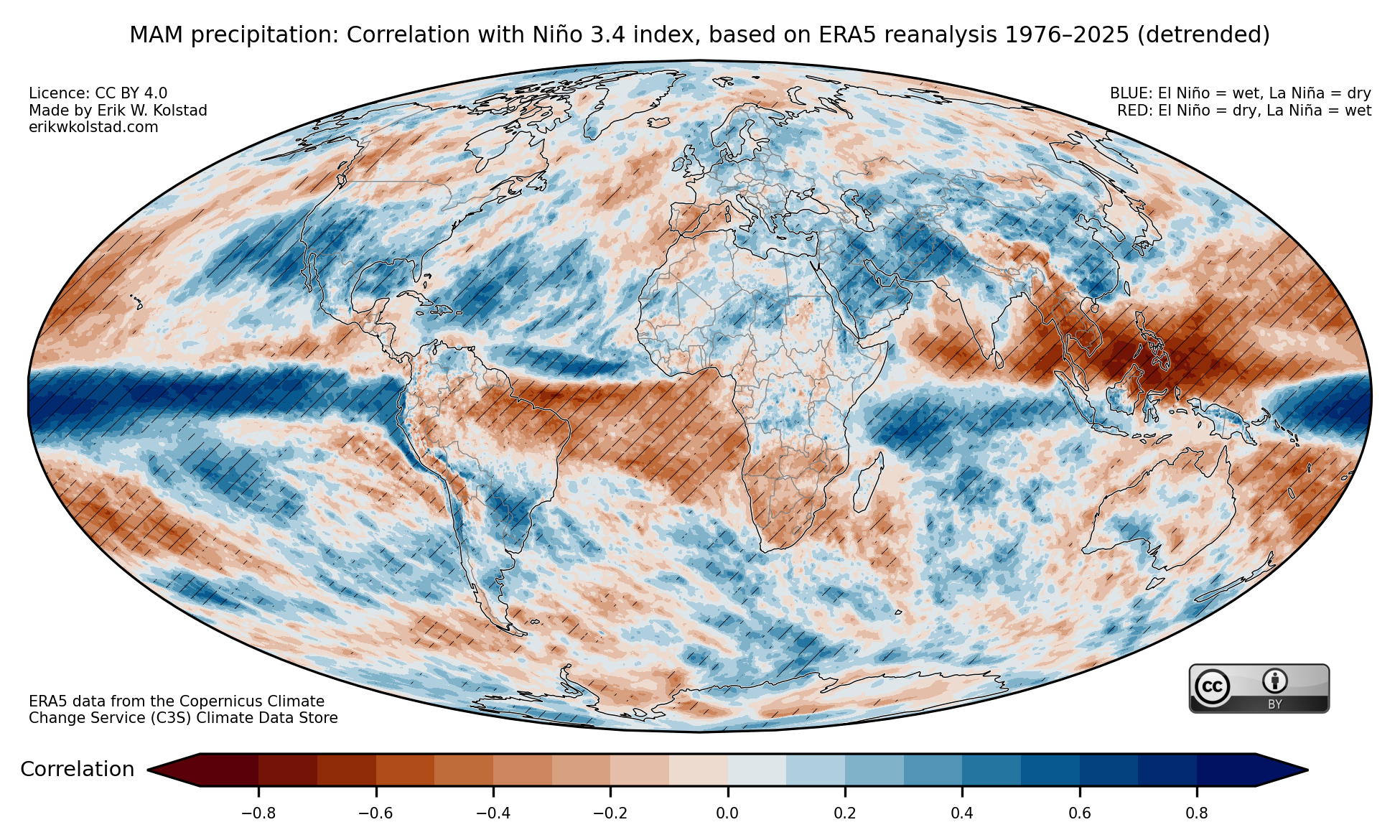
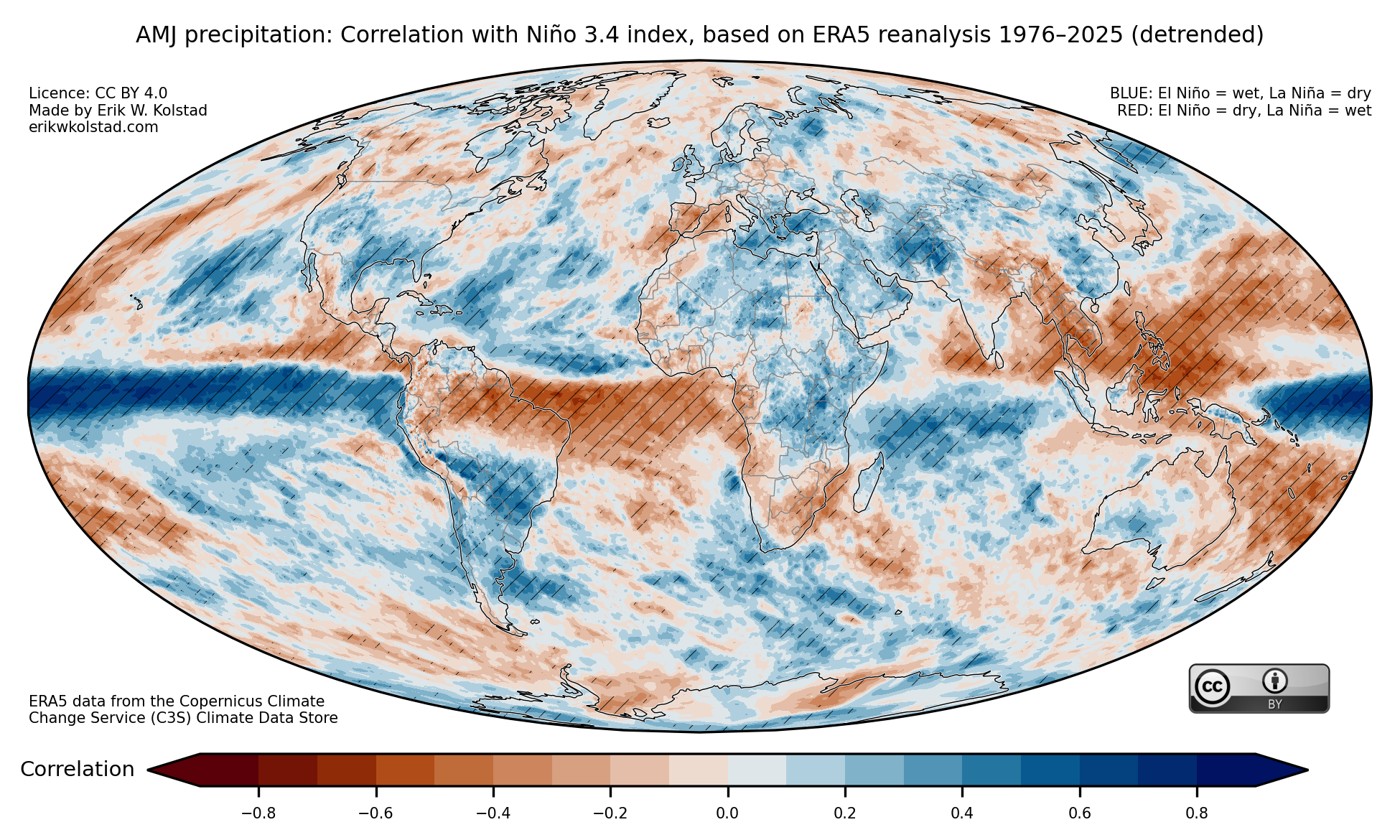
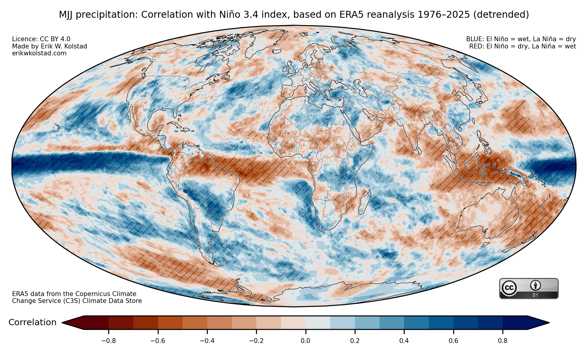
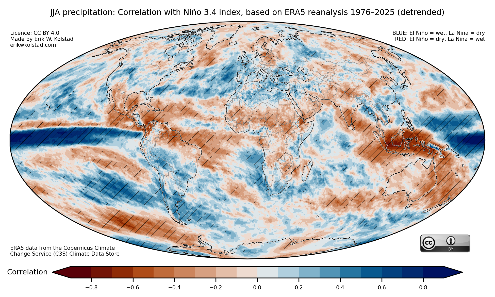
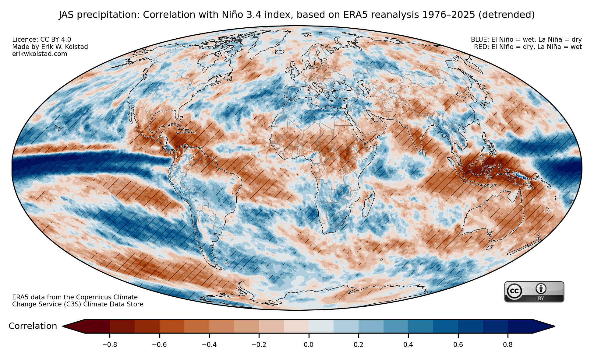
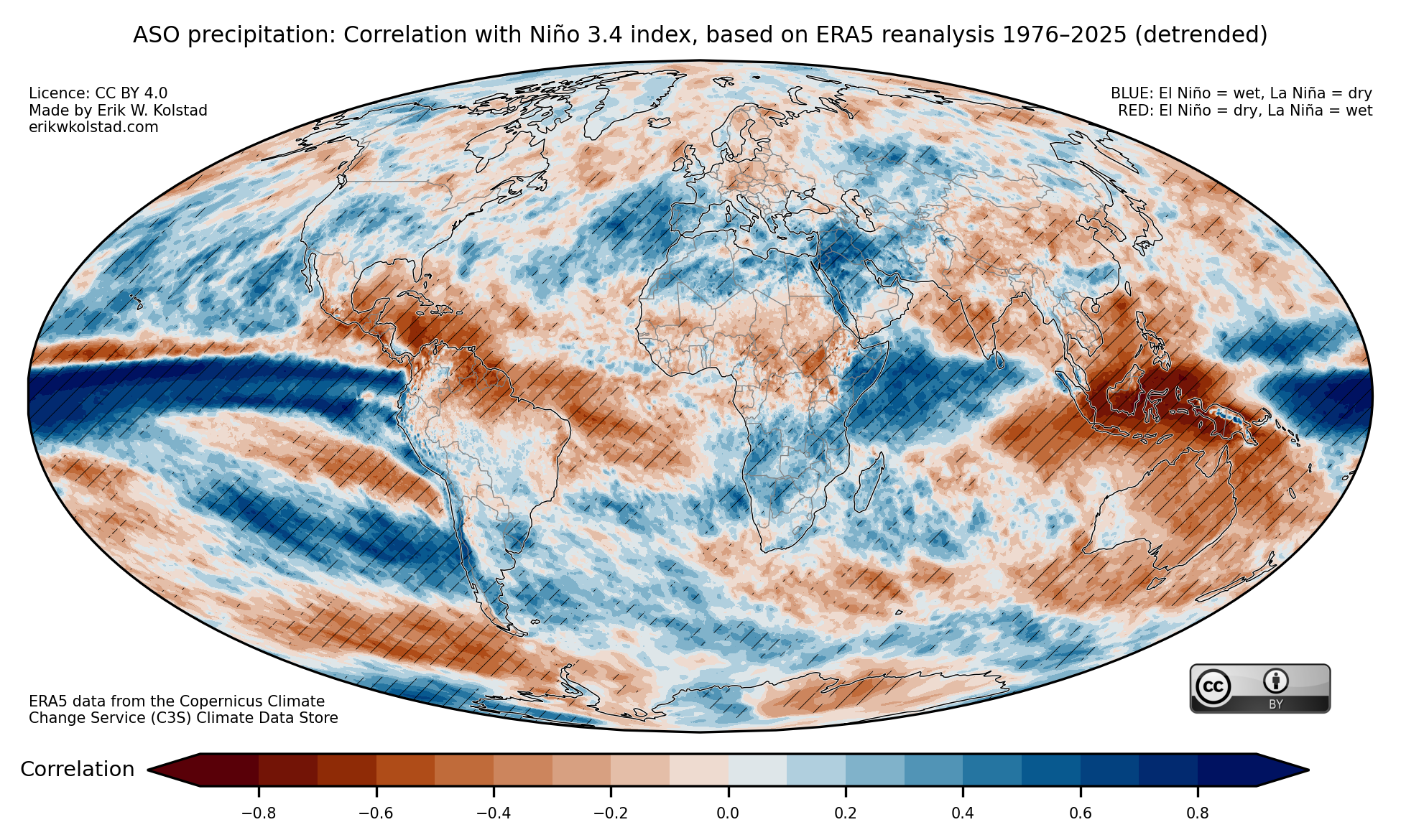
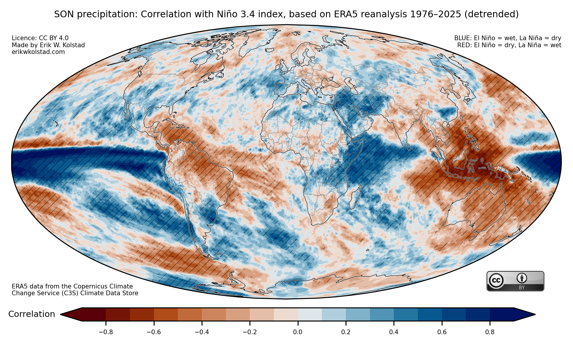
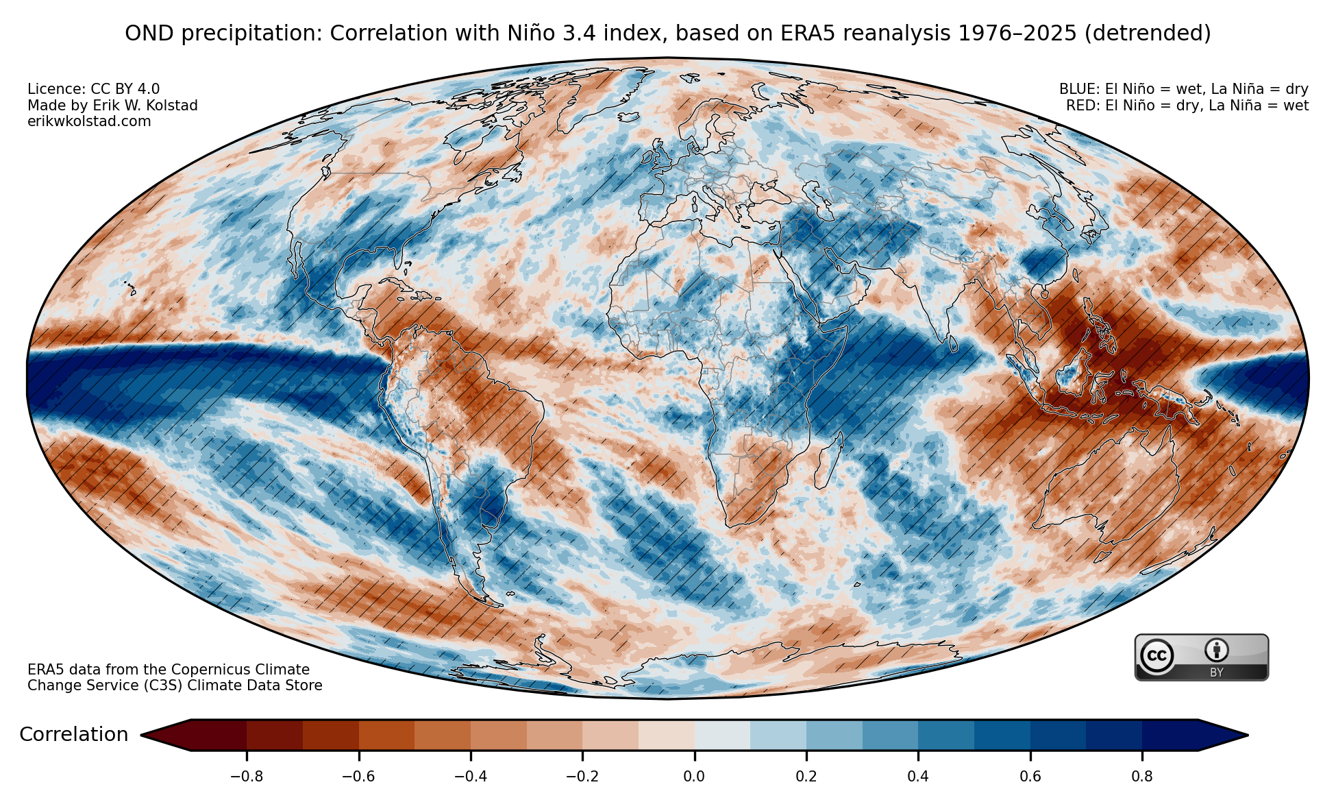
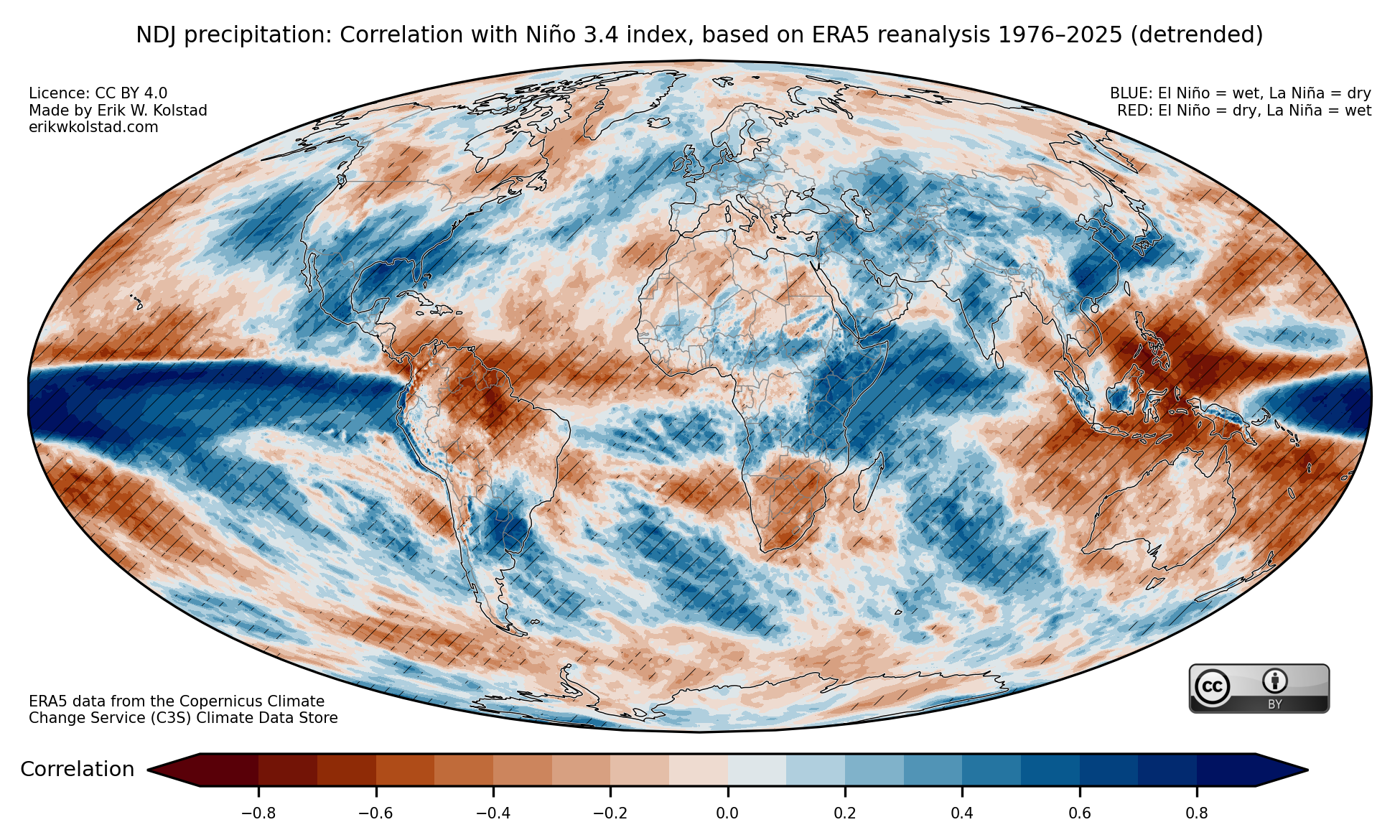
The next gallery shows correlations for precipitation.
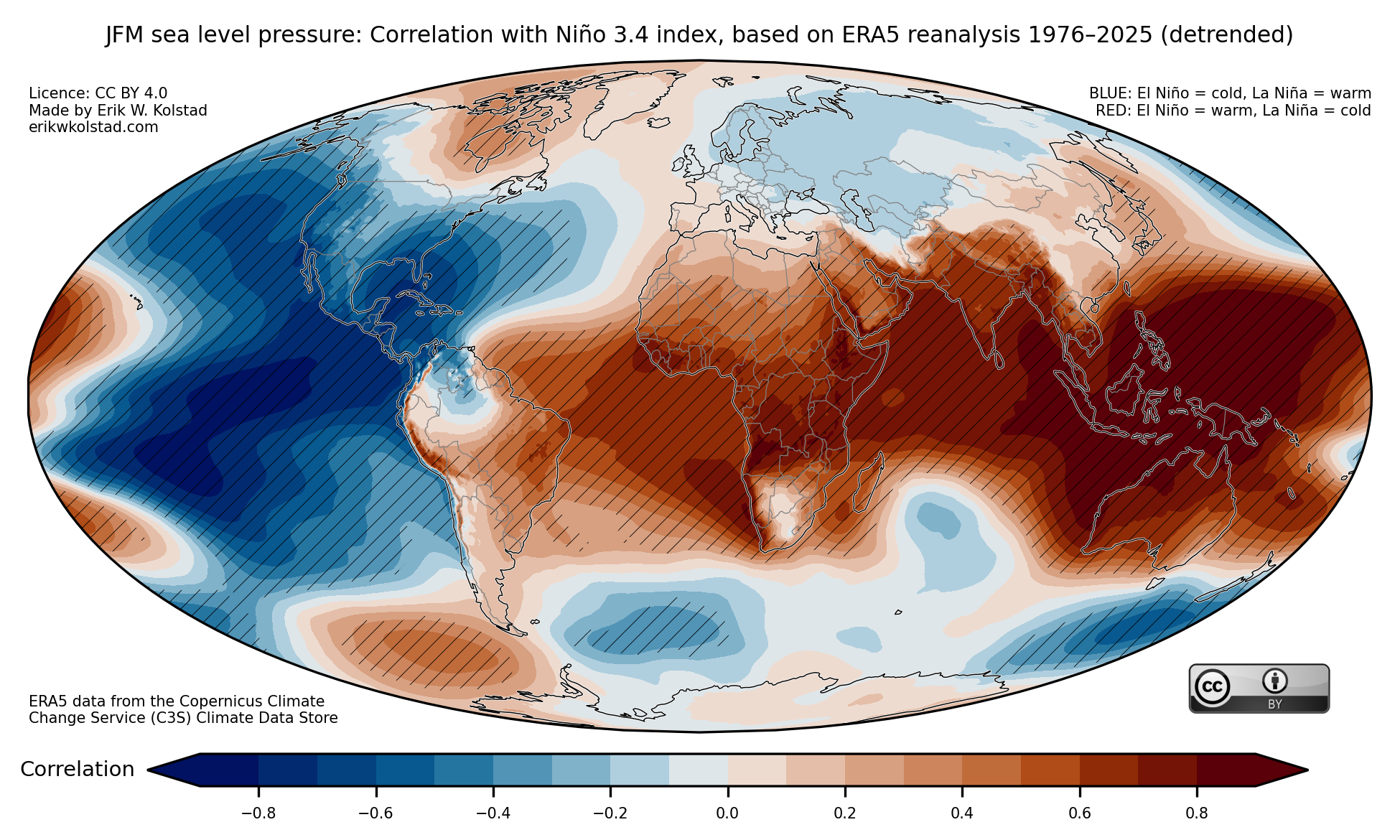
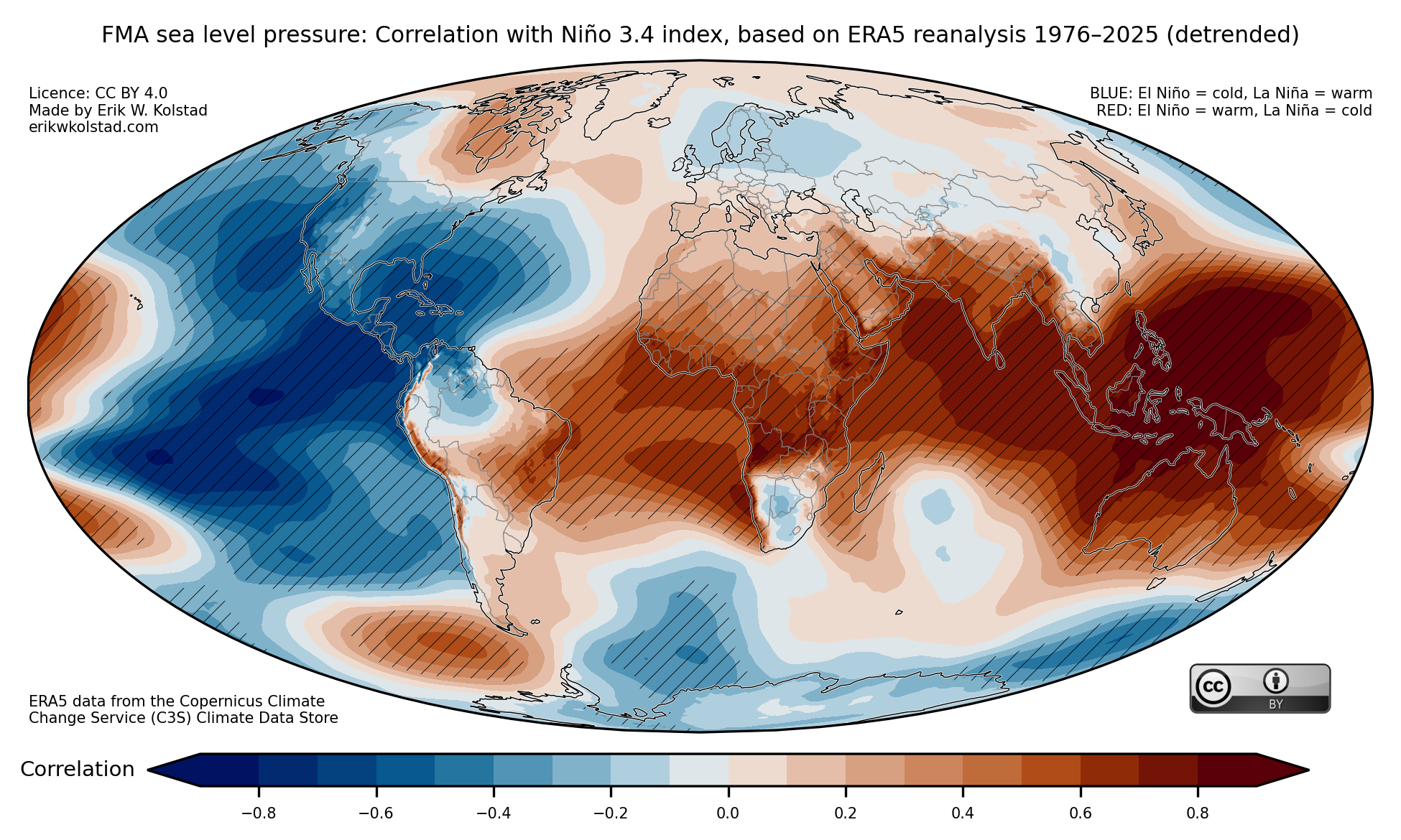
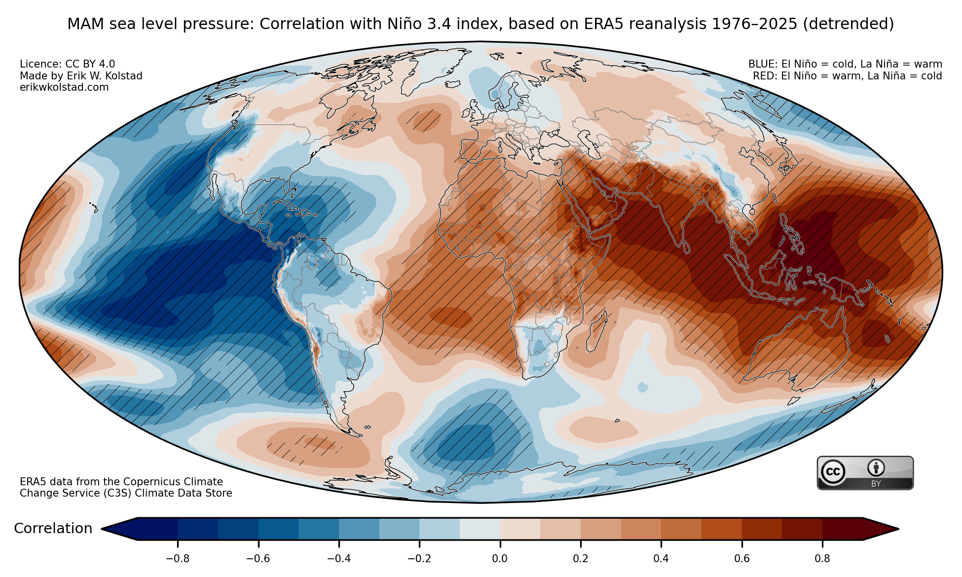
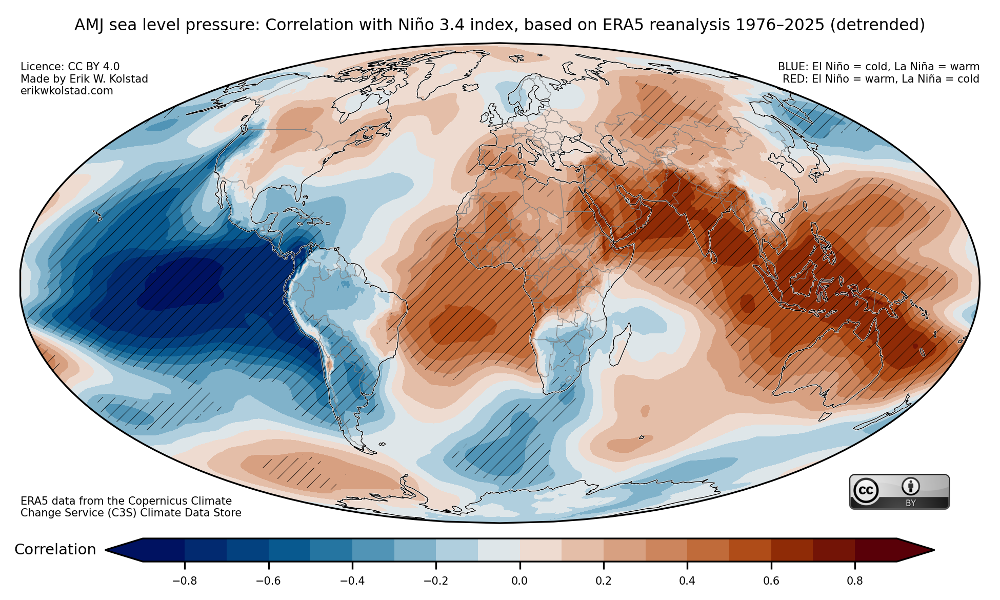
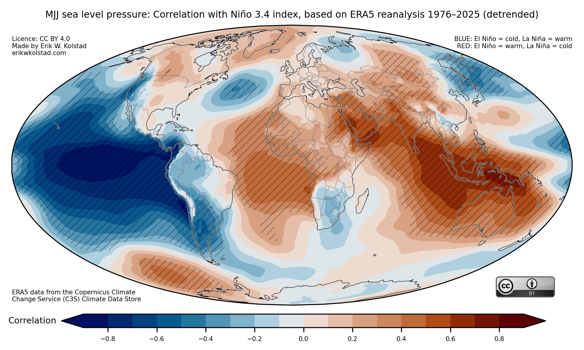
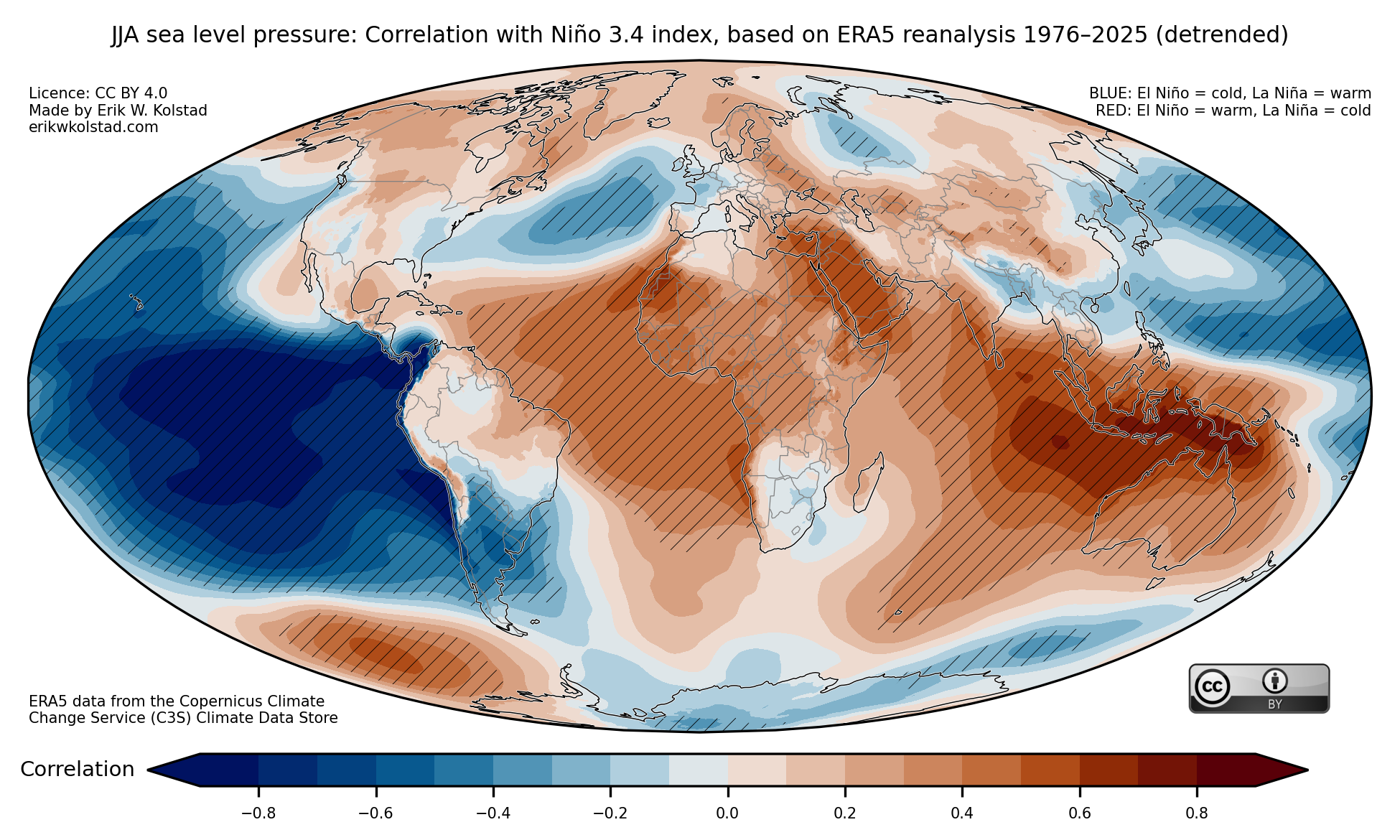
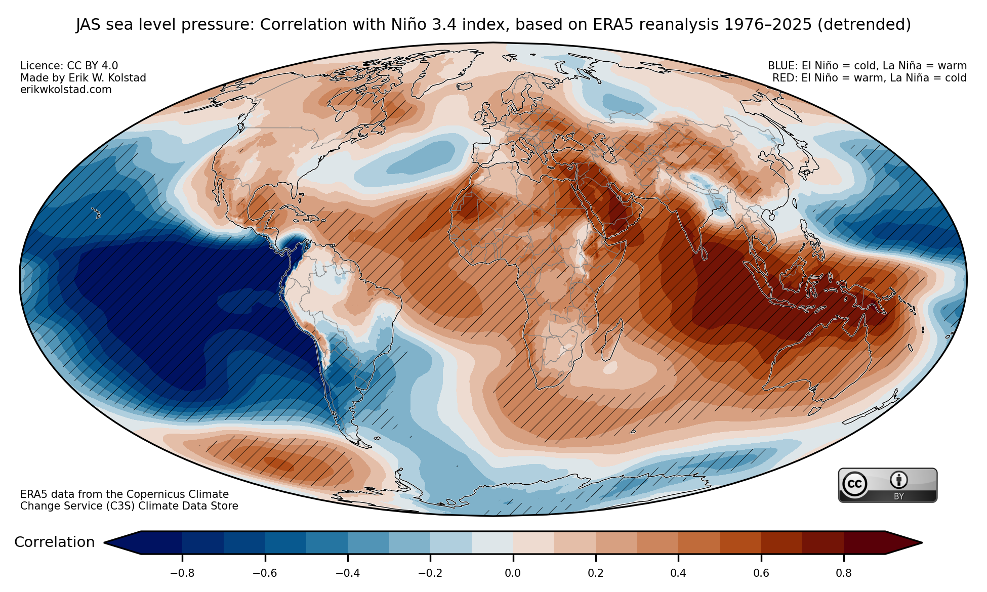
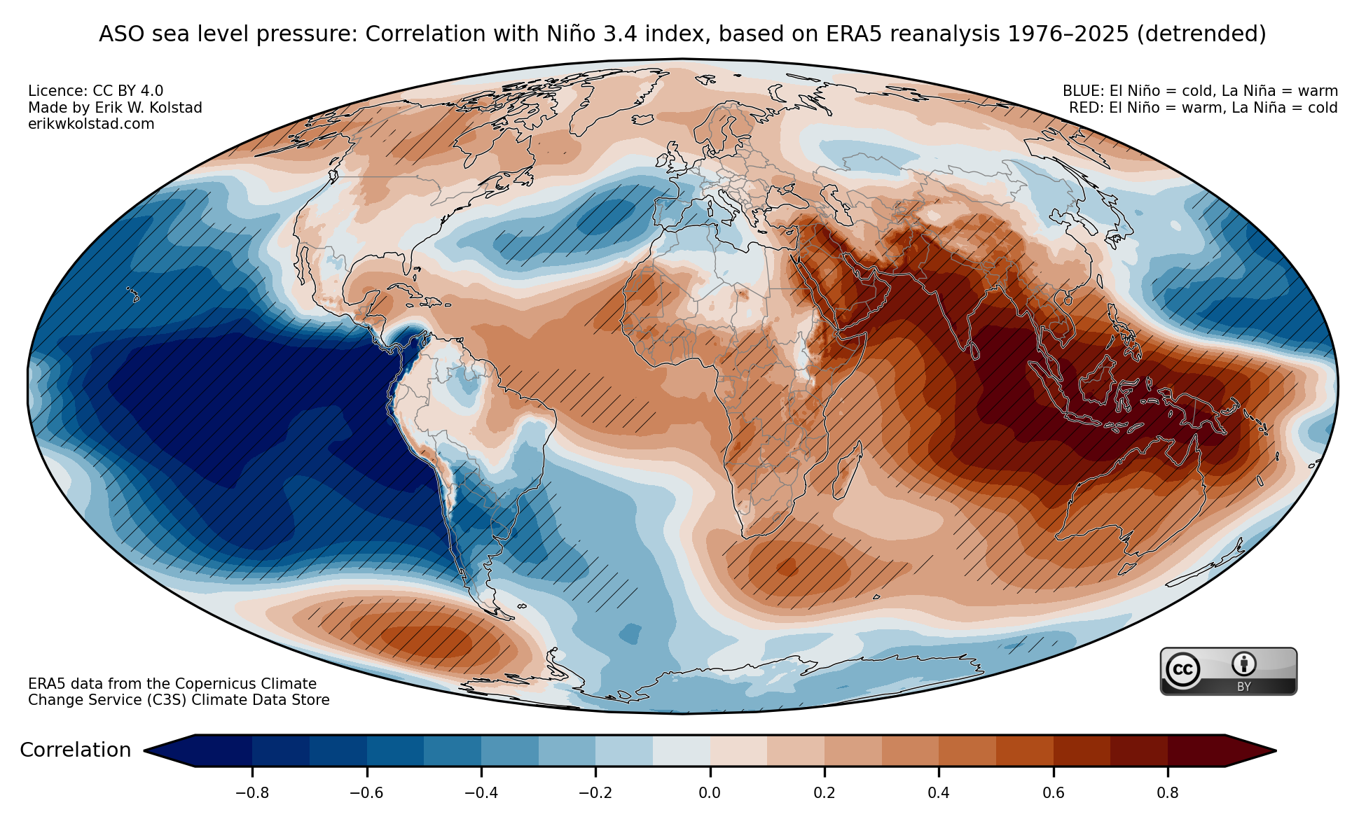
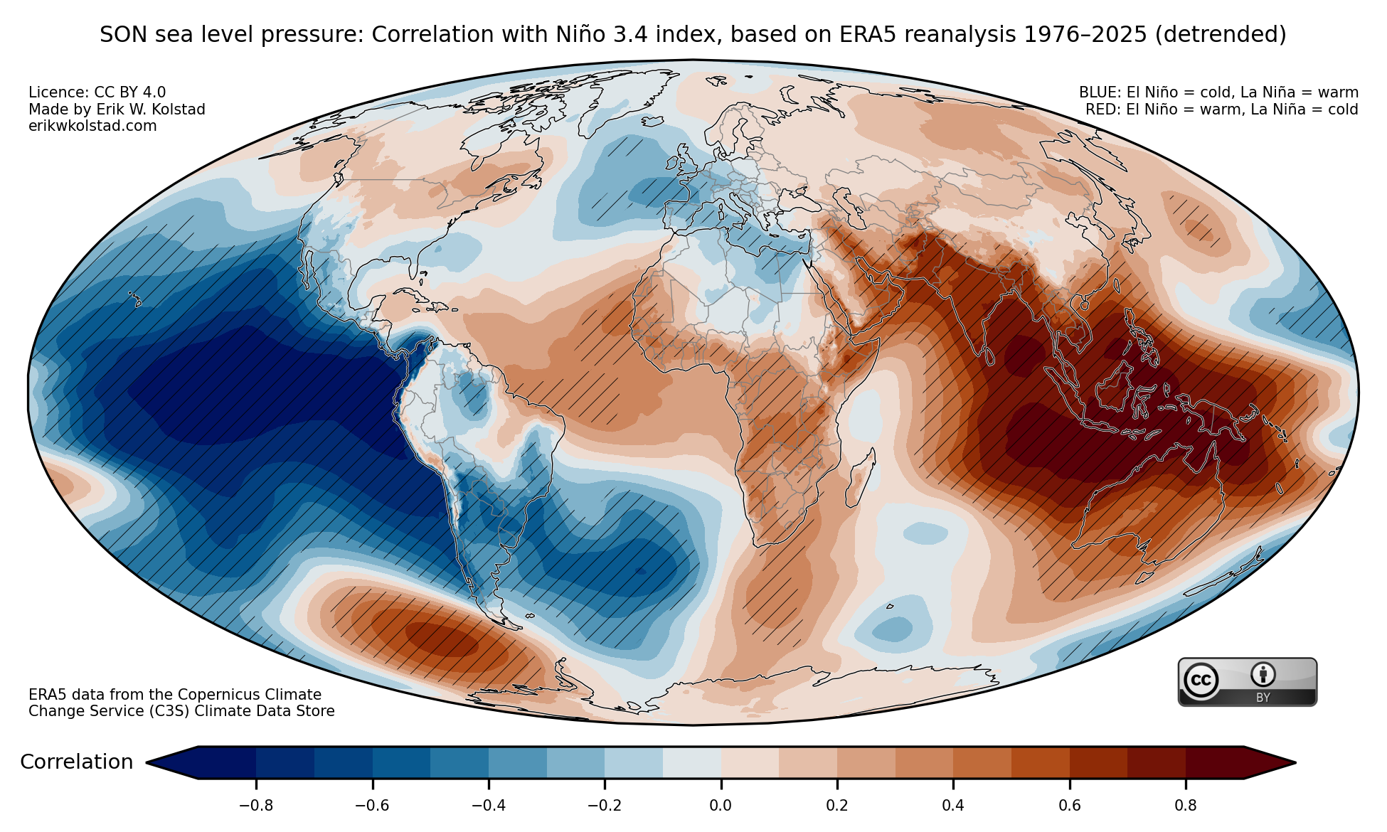
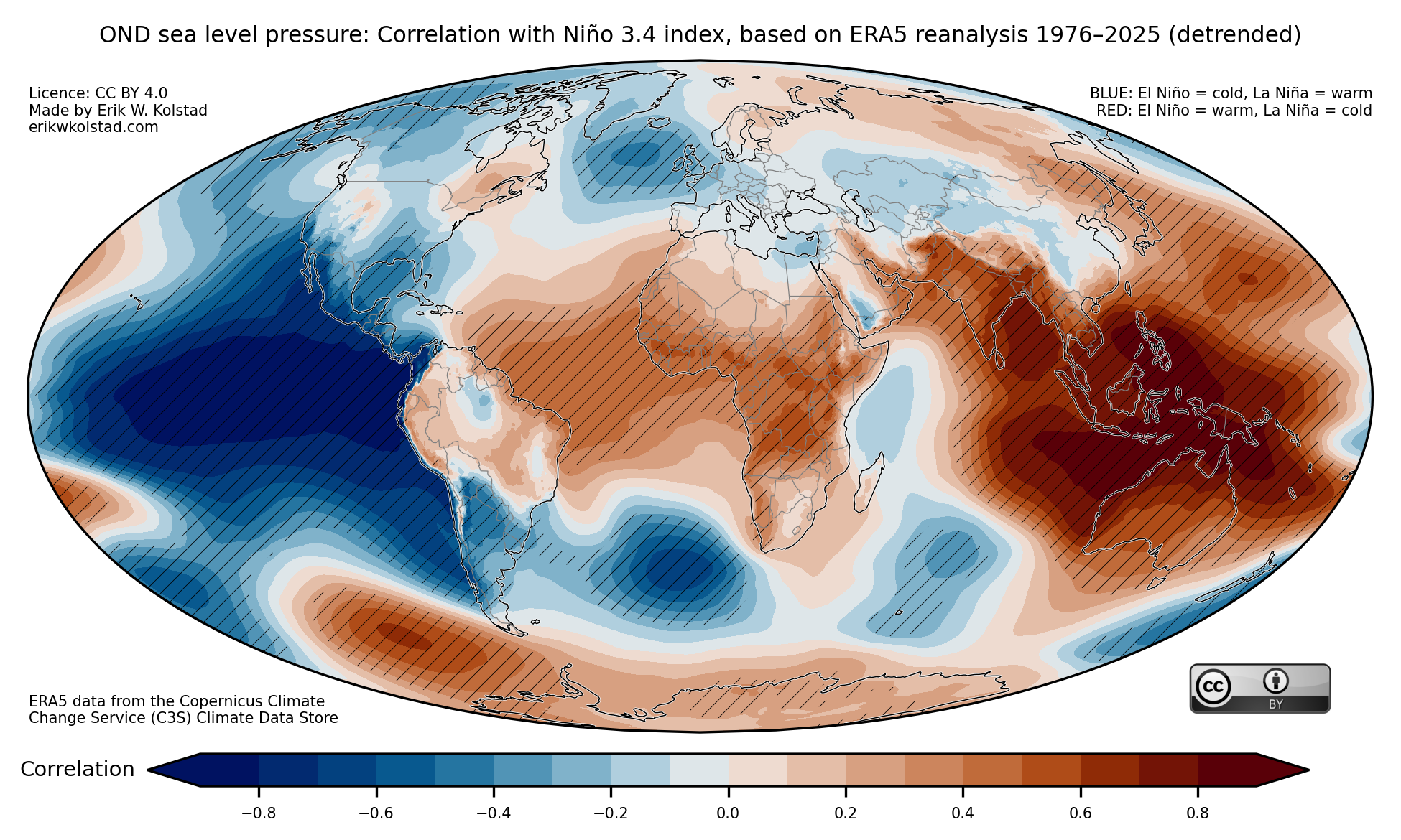
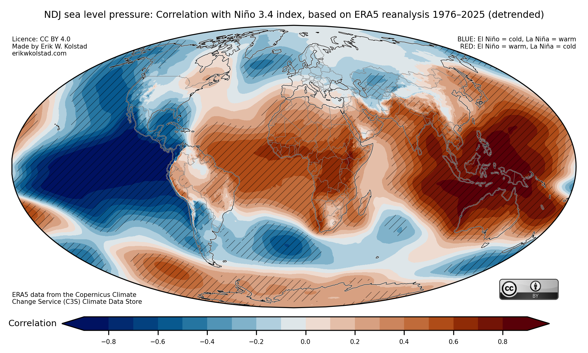
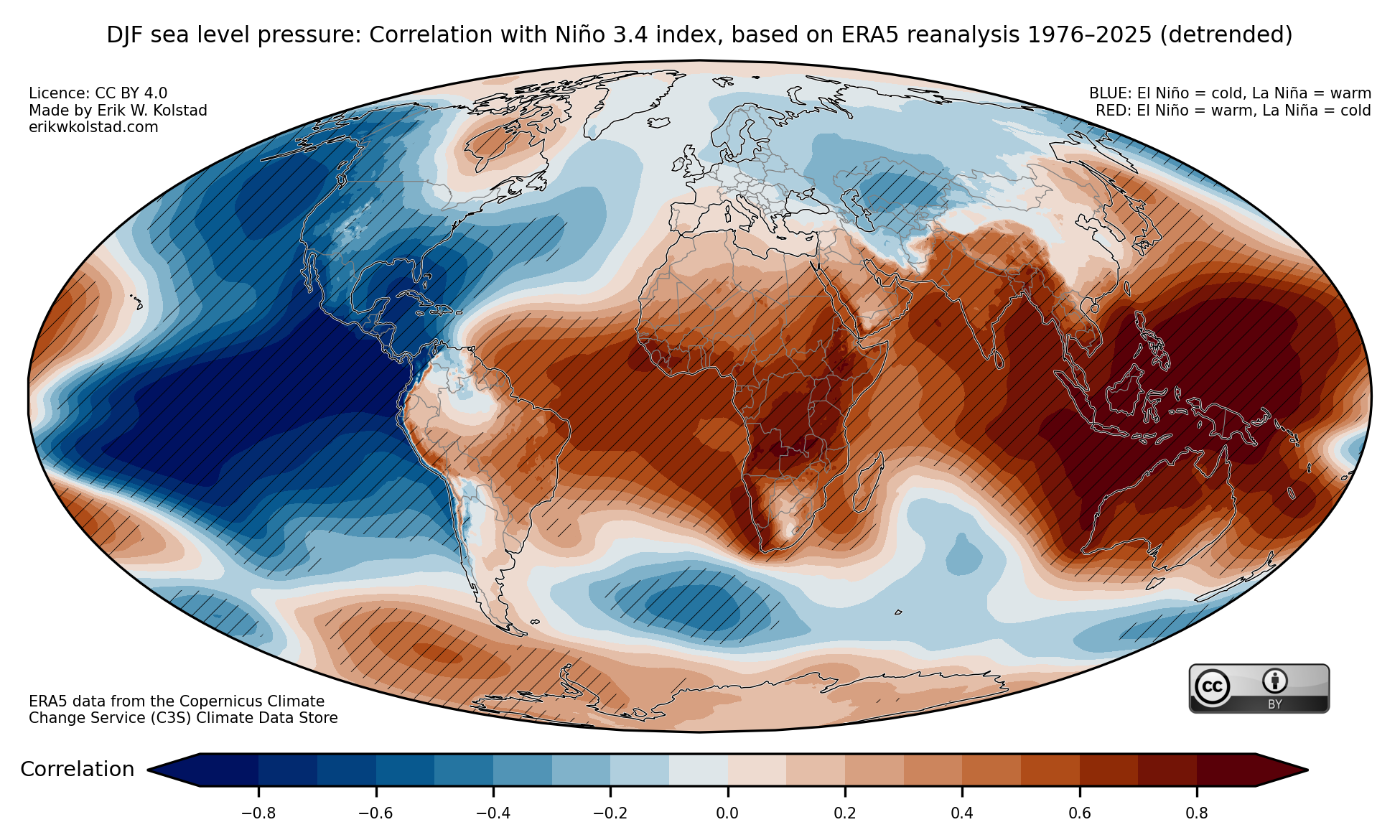
Finally, here are the maps for sea level pressure:
Hope this is useful! Please contact me if you have suggestions for improvements.
Methodology
I used monthly mean ERA5 data for sea surface temperature (SST), 2-metre temperature, (total) precipitation, and sea level pressure. All the data were downloaded for the period 1976–2026 (up to February only), and I linearly detrended all the data at the grid point level. The Niño 3.4 index was computed as the area-averaged SST anomaly between 170 and 120 deg. West, and from 5 deg. S to 5 deg. N. Statistical significance was estimated through bootstrapping, where the elements of the Niño 3.4 index time series were drawn randomly with replacement 100 times. Significance at the 5% level occurs when the actual correlation is outside the interval between the 2.5th and 97.5th percentiles of the boostrapped series.
